Buy any 1 product and get 1 absolutely free — this offer applies to all Website Templates, UI Kits, and Complete Scripts.
Buy Now! Article Information Table Of Contents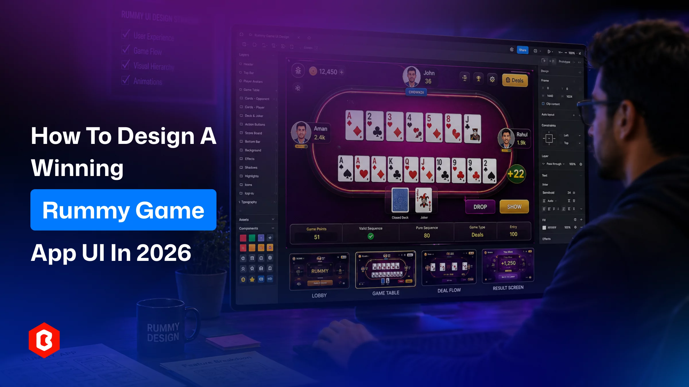
Card hand sized and fanned for one-thumb readability
Draw and discard piles visually distinct and centrally placed
Touch targets sized for fast, repeated taps
Variant-specific elements built as modular components, not separate screens
Contrast-tested for accessibility, including a colorblind suit mode
Dealing and discard animations tuned for feedback, not just decoration
Layouts tested across phone, foldable, and tablet breakpoints
Most rummy game guides walk you through licensing, server architecture, and development cost, then treat the interface as an afterthought - a checkbox called "App UI/UX design" squeezed between "choose a platform" and "start coding." That approach misses the core point. A card game UI is the only real differentiator a player notices in the first ten seconds of opening your app on iOS and Android. This matters as dozens of card game apps offer nearly the same rules.
The rummy interface works through some important aspects, including layout logic, interaction patterns, and screen-by-screen structure. Here's how a ready-made mobile game UI kit can shortcut months of design work. Whether you're building classic Indian rummy variants or a two-player gin rummy card game UI kit, the principles apply.
Card games are not shooters or puzzle games. Its overall experience is fixed and depends on an information-dense surface including a table, a hand of cards, a discard pile, and a handful of controls. There's no camera to pan or level to explore. Every pixel on that table either helps a player make a decision or gets in their way.
That's a different design problem than "make the app look modern." It's closer to product design for a financial dashboard than to designing a mobile game. So, legibility, timing, and touch precision matter as much as visual polish. A UI kit for card games gin rummy-style titles needs to solve this compressed, high-stakes layout before it worries about theme skins or seasonal art.
A player's eye should land on their hand first, the discard pile second, and the opponent's card count third, in that order, without conscious effort. Try to manage the player’s own cards, including the largest and closest to the thumb zone. Fan them slightly so every suit and rank stays readable even when the hands are full. To make a table active zone, discard and draw piles sit at the visual center where a subtle shadow elevates.
What truly makes a card game interface interesting is how easy it is to select, drag, and drop a card without misfires. Prioritize interactive elements like cards, the draw pile, and the declare button to meet minimum touch-target sizing (44-48px on standard mobile screens). That consistency has to be maintained even with 13 or more cards in the hand. Overlap cards intelligently so the top-most or currently-focused card always has enough exposed surface area to tap accurately.
Green and felt-inspired tones remain the default table background for a reason, as they read instantly as "game surface" and create contrast against white playing cards. But 2026 UI kits go further, offering multiple theme options (midnight, wood, casino red). This helps operators match branding without redesigning the layout. Whatever palette you choose, keep suit colors (red and black, or four-color decks) at full saturation. Another side, muted suit colors are the single most common cause of misread cards in usability tests.
Rummy is played fast, often with a countdown timer running. Card ranks and suits need a typeface that stays legible at small sizes and slight rotation. Avoid decorative or condensed fonts on the cards themselves. Reserve expressive typography for lobby screens, banners, and rewards, where speed-reading isn't a factor.
A complete mobile game UI kit for rummy needs to cover the full player journey, not just the table view. Here's the screen set that most professional kits, including gin rummy–focused ones, build around.
Signup should take under a minute: phone or social login, avatar selection, and an optional tutorial. Many kits include a guided walkthrough overlay that highlights the draw pile, discard pile, and declare button on a player's first game. This alone reduces early drop-off more than any visual redesign.
At the lobby, players select stakes, variant, and opponents, so don’t be fancy here. Group similar options (Points, Pool, Deals) into clearly labeled tabs. Avoid a one-long scrollable list and give private-table creation its own prominent entry point. This feature drives repeat sessions with friends.
This is the core screen: player hand, opponent card counts, draw and discard piles, a turn timer, and action buttons for sort, group, drop, and declare. Everything on this screen should be reachable without the player's thumb leaving a comfortable arc. We recommend testing it one-handed on a standard 6-inch device before finalizing spacing.
Dashboard design is the most important aspect in any card gaming mobile application. Players are constantly watching their rankings, win streaks, and loyalty points on a dedicated screen. Here you should create a visual separation between “your rank” and “top players.” This saves users time because they don't have to scroll to see where they stand.
Sound toggles, notification preferences, and an option to reduce ad interruptions are small screens that get overlooked in early design passes but directly affect session length and retention. Consider these accessibility settings in the card game app development.
One gap in most development is that they list rummy variants (Points, Pool, Deals, 21-card, two-player gin rummy) as separate features without addressing the UI implication: each variant changes card count, scoring display, and round structure, but shouldn't require a separate interface.
A well-built card game UI uses a modular table layout with the same draw/discard/hand structure. Its variant-specific elements (point counters, deal trackers, knock indicators for gin rummy) are swapped in as configurable components. There’s no requirement for redesigned screens. This is exactly the kind of flexibility a purpose-built UI kit should offer and saves variant multiplies both design and development time.
The moment cards are dealt sets the tone for the whole match. A quick, physics-based deal animation for cards sliding into place signals polish immediately. There are two choices: swipe-to-discard and tap-to-pick gestures should include subtle motion feedback (a slight lift or glow). So, players always know their input registered before the server confirms it.
In card games, a visible and animated countdown helps reduce disputes and keep the playing experience pace maintained. The good practice is to pair it with a soft audio or haptic cue in the final few seconds. This could be quiet enough to hold the attention but not so intrusive that prompt action from a distracted player.
This is a focused area in most rummy development not mentioned, yet it directly affects app store ratings and reach:
Maintain a minimum 4.5:1 contrast ratio between card suits and the table background for users with low vision. This is important for accessibility features.
Support both landscape and portrait table layouts; many players hold their phone differently mid-game as a preference.
A phone layout is important, but design for foldables and tablets separately. Maintain card spacing that works at 6 inches; often looks sparse or cramped at 10 inches.
Offer a colorblind-friendly suit mode (shapes or patterns in addition to red/black) as a settings toggle right to the thumb reach.
Keep tap targets consistent across screen densities. This keeps the gameplay feeling the same on a budget Android device and a flagship iPhone.
Building every screen above from a first level is realistically a multi-week design effort even before development starts. A dedicated gin rummy card game UI kit such as the Gin Rummy Figma UI kit from Theme Bitrix gives teams a working structure to adapt rather than invent.
The UI kit is built specifically around the two-player gin rummy format and includes:
A standard 52-card deck layout
Profile setup and progress-tracking screens
A leaderboard dashboard
Settings covering sound and ad preferences
It ships as a Figma file with an included prototype, customizable vector shapes, free fonts and icons, and screens optimized for both iOS and Android. The components are editable. Card game app development teams can restyle colors and icons or extend the layout toward other card formats. The same base has been adapted for poker and Teen Patti–style interfaces.
Designers have a tested layout to adjust for their own branding, variant rules, and monetization flow in a card game. At $45, it functions as a starting template rather than a finished product. Most game app development teams still customize colors, card art, and copy, but it gives development teams a working prototype to build against immediately. Avoid starting UI research from the initiative level.
A rummy app's rules rarely change from one competitor to the next. However, the real separation is in the interface, where the real competition happens. Get the table hierarchy, touch targets, and variant flexibility right, and the rest of the product feels faster and more trustworthy by default. For game development teams that don't want to start that process from a zero step, a purpose-built resource like the Gin Rummy Card Game UI Kit offers a tested Figma foundation to adapt rather than custom design.
Card game UI is a fixed, information-dense table layout where legibility and touch precision matter more than movement or exploration compared to other types of games.
Onboarding, lobby, live gameplay, leaderboard, and settings, plus optional reward screens. These are the core screens that most rummy apps need.
Yes, if the table layout uses modular scoring and round components instead of separate designs per variant.
Yes, it supports prototyping, component reuse, and easy handoff to game developers. So, you can use Figma for card game design.
We recommend designing for a standard 6-inch phone screen first and then going for a spacing for tablets and foldable devices.
 Similar Blogs
UI design plays an important role in the success of a mobile game. We can consider it as a bridge be...
If you are making a mobile card game, a good design is important. It helps players enjoy the game an...
Designing a card gaming app can be fun, but it also brings many challenges. You need to create a use...
In puzzle game development, you have to invest time properly. Like, wireframe the concept, prototype...

Meal planning often starts with a simple question. What are we eating today? For one day, that is ea...

A meme coin project needs a clear online presence. The website can explain the project to visitors....
Related Products 
Not sure which template or UI kit fits your project? Reach out for expert advice.
 100% Satisfaction Guaranteed
  Shop with Confidence!
 Tags
Tags