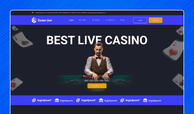
Buy any 1 product and get 1 absolutely free — this offer applies to all Website Templates, UI Kits, and Complete Scripts.
Buy Now! Article Information Table Of Contents
Someone lands on a casino website with money already on their mind. Not "will I win," but "is this thing even real?" That's the question your interface answers first, before a single game loads, and it's answered in the first few seconds, before the visitor reads a word of copy or checks a single review. Casino website UI design isn't there just to look sharp. It's doing the work of a first background check, whether anyone designed it to or not.
Engagement only matters after someone decides to trust you with a deposit, and that decision happens way earlier in the process than most teams plan for. This guide is about that earlier moment, what makes a gambling interface feel safe, what quietly tips it into feeling risky, and where a well-built UI kit actually earns its cost back.
A casino doesn't ship anything you can hold. There's no box to open, no return policy that proves the thing worked as promised. A player deposits money on the strength of a promise that the platform pays out fairly, protects their card details, and does what it says on the tin. Nothing confirms that promise except the interface itself, repeated screen after screen.
So people (and regulators, and payment processors) end up treating design quality as a stand-in for operational honesty. It’s not entirely logical, but help to humans assess the size of the risk: if the buttons are misaligned and the layout feels thrown together, why would the back-end be any more careful?
A sloppy casino website UI design doesn't just look bad. It quietly tells visitors the operator cut corners somewhere else too.
A few things show up again and again in gambling interfaces that players actually stick with.
If the withdraw button lives in the same spot every time, if menus don't reshuffle themselves between sessions, players relax a little. Nothing here is flashy, so what? It’s just consistency doing quiet work in the background.
It cuts against how physical casinos operate. When you walk into a casino floor, the design is interesting with lights, sound, and constant movement. On online websites, the manipulative object work is compared to be exciting. Players can see autoplay videos, banners, and pop-ups stacked three clicks deep.
The casinos that actually earn repeat deposits favor looking almost boring by comparison: clean hierarchy, breathing room, animation that's there for a reason instead of running on a loop.
Then there's transparency, which sounds obvious but gets ignored constantly. Licensing info, RTP numbers, wagering terms none of it should require a scavenger hunt. If you put that stuff three clicks deep, players assume you're hiding something, even if you're not.
People give your online casino credit when a brand speaks for itself. For that, the same logo, same color system, same type across the homepage, the lobby, the cashier, and the mobile app should exist. The moment any of that drifts, a small alarm goes off in the player's head: wait, is this still the same site?
Some elements pull more weight than others. A few worth treating as mandatory:
It’s not tucked into the footer where they read like an afterthought nobody wanted to highlight. Another thing: a live chat tool icon that's actually reachable on every screen tells players a human exists somewhere behind the platform. Payment icons near the deposit button, recognizable logos, familiar security marks. All these aspects cut hesitation right at the moment it matters most, when money's about to move.
On the gambling website, especially for the casino, live dealer tables are important to showcase active player counts, table limits, and connection health. It's a small thing, but it mirrors what you'd notice walking up to a table in person. Responsible gambling tools, including deposit limits, self-exclusion, and cooldown periods, work better sitting in the account dashboard. Adding it to the legal page nobody reads.
Ultimately, presenting these controls is about building trust rather than scaring anyone off. It signals the operator isn't purely there to extract.
Timestamped, plain language, no jargon help that the platform is simple and easy to play the casino games. If anything has happened, players should be able to check their own activity without opening a support ticket to translate it for them.
It's rarely one big failure. Usually it's important to know:
A deposit button that's slightly off-brand from everything else appeared on the page.
Game thumbnails that stutter or break on mobile, making the whole platform feel unattended.
Terms and conditions shrunk down two font sizes like they're meant to be skipped.
Spacing that's a little inconsistent here and there, nothing dramatic on its own, but it adds up to a general sense that nobody's really watching the details.
And withdrawal flows that take more steps than deposits, which experienced players notice immediately and never forget.
None of this is usually deliberate. It's what happens when a platform gets built in pieces. This includes one contractor for the lobby, another vendor for the cashier, mobile design compromise at the end with nothing holding the whole thing to one visual standard.
This is the gap a properly built casino UI design kit is meant to close. Instead of stitching a lobby from one source, a cashier flow from somewhere else, and a mobile layout as an afterthought, a team can start from one system where every screen already speaks the same language.
It's a Figma-based casino website UI design running over 15 screens:
Live game lobby
Player dashboard
Wallet
Deposits
Withdrawals
Transaction history
All of these have been built as one connected system rather than a disconnected set of templates. Because the components, spacing, and typography stay consistent across every screen, the kind of drift that usually doesn’t affect trust.
A product manager has a full design cycle to launch such a platform and doesn’t have to wait for months for a visual product.
The app UI and UX design team can use these editable, layered component assets that can be rebranded without starting from the first level: UI research.
Front-end and back-end developers get this UI kit as a reference that is already responsible for how casino information architecture actually works, like live tables, player profiles, and financial flows.
So, there's less guessing about how the pieces should connect. And since it was built specifically for live casino platforms, the trust-relevant stuff above, like visible balances, transparent game status, and structured account management. This is already made, rather than something a team has to bolt on later.
Worth running any casino or betting interface through this before launch:
Can visitors see licensing and security certification without scrolling?
Do payment screens use icons players actually recognize?
Are responsible gambling tools two clicks away, not twelve?
Does mobile match desktop in both function and polish?
Is withdrawing as easy as depositing genuinely? Or does it look unique just on paper?
Does the design stay consistent from the homepage through the cashier?
If the answer's yes across the board, that's usually a sign the platform was built on one coherent system. It’s not stitched together under deadline pressure.
Casino UI design work is to keep people engaged and prove on every screen that the platform deserves their money. Interfaces that feel trusted and consistent get the benefit of the doubt. User Interfaces that feel improvised don't get a second look. For teams that would rather skip months of trial and error, starting from a purpose-built, trust-aware casino website UI design, a ready Figma kit. It becomes the faster route to a platform people are actually willing to deposit into.
It's both, but the trust angle gets overlooked. A cashier page that hangs for three seconds makes players wonder if the systems handling their money are just as shaky. Speed isn't only about convenience here; however, it's read as a proxy for reliability.
To prove security and calm, blue and green colors have been used on casino websites around wallets and account areas. Reds and golds carry the excitement and are used near games and promotions. Blending both lets a site feel exciting without feeling reckless with your money.
Increasingly, yes. Hiding return-to-player percentages behind a help article feels confusing even when there's no bad intent behind it. Regulators in several markets are already pushing operators toward clearer, upfront disclosure, and interfaces that get ahead of that goal to earn more goodwill.
Short-term, they might nudge a metric up. Compared to the long term, players notice, especially the ones who've been burned before, and word travels fast in gambling communities. Add regulatory attention on top of that, and the trade-off rarely pays off.
It does, even if players can't always articulate why. The platform considers every player’s needs and reads as a trusted run, not just more compliant. And in regulated markets, skipping accessibility is a licensing requirement.
 Similar Blogs
Have you ever played and learned about the best experience for exciting mobile gaming? So, welcome H...
Hamster Kombat is a tap-to-earn crypto game where players are designated as virtual CEO. In developi...
The world of gaming has thrown some curveballs our way, but Hamster Kombat might just be the most ad...
UI design plays an important role in the success of a mobile game. We can consider it as a bridge be...
Everyone has seen the online casino industry grow. It is popular because it offers the convenience o...

Players rarely leave a casino site without a reason. Most departures happen quietly. No complaints,...
Related Products 
Not sure which template or UI kit fits your project? Reach out for expert advice.
 100% Satisfaction Guaranteed
  Shop with Confidence!
 Tags
Tags