Buy any 1 product and get 1 absolutely free — this offer applies to all Website Templates, UI Kits, and Complete Scripts.
Buy Now! Article Information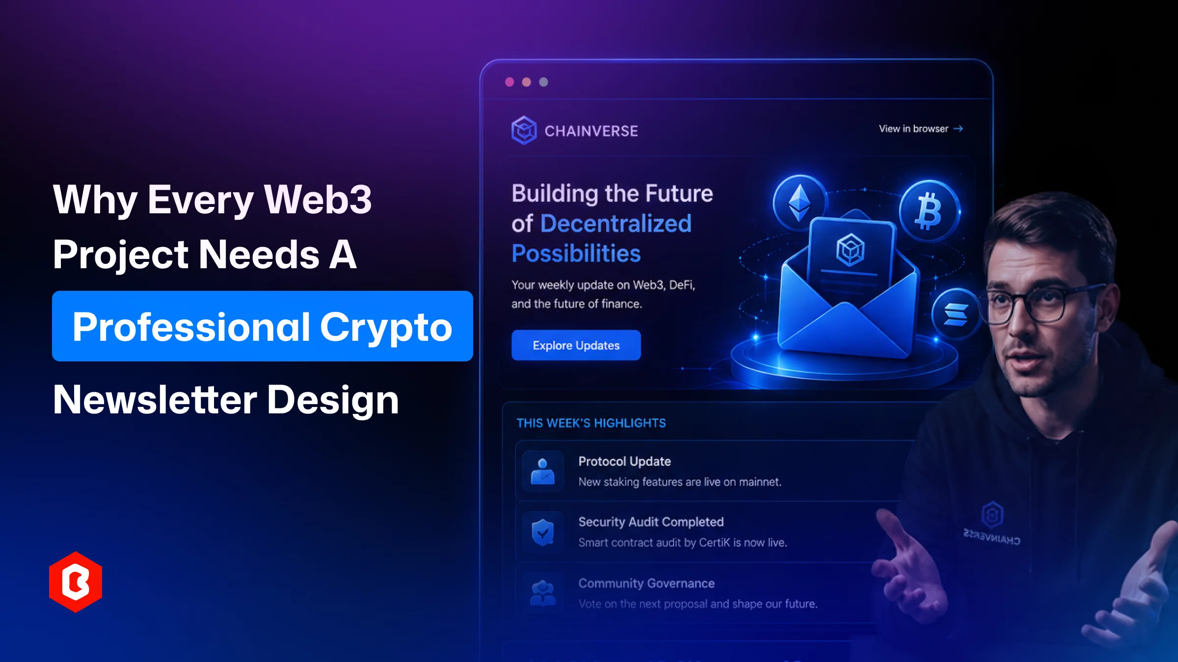
Crypto founders are waiting six months to get the result of a smart contract audit report. Send it to the community with a broken logo and three different fonts in a plain-text email. In this market, trust gets built through small signals as much as design presentation, and that mismatch costs more than it looks like it should.
The cryptocurrency market still has a trust problem. Rug pulls and copy-paste projects have made people careful about which updates they open and whose links they click. For a lot of subscribers, the newsletter is the first regular contact they have with a project outside the Discord server. Design is usually the fastest thing they judge it by, often before they've read a single line.
This article looks at what a professional crypto newsletter design actually involves, which features DeFi readers actually care about, and how different people on a Web3 team end up using it.
At its core, this is about how a newsletter's layout, type, color, and content order work together so an update is easy to read and matches the project it comes from. It's more than a header banner. It's the decision of where price data goes, how a protocol update is framed next to a governance vote, and what the reader sees first when they open the email on a phone screen at 7 am before a coffee.
For a Web3 project, the newsletter usually has to sit next to a dashboard full of charts and numbers on the website, and a trading interface with its own visual rules. The email version is the simplified read of all that, including the story version, not the raw data. It works better when it looks like it came from the same brand as the site, instead of a generic template designed from whatever email tool the team picked in a rush.
That's partly why a lot of teams start this work backwards from where you'd expect: they lock the visual system on the website first. A cryptomail UI kit gives a website project its color palette, iconography, and section layout in one place. Once that's set, carrying the same look into email campaigns is a lot less guesswork, and the brand ends up feeling like one thing rather than five separate experiments.
A crypto newsletter isn't a blog post that got squeezed into an email template, or at least, it shouldn't read like one. Usually, DeFi readers are checking updates between trades, comparing several projects at once, and already skeptical of anything that looks thrown together. Premium design choices decide whether an email gets opened next time or filtered straight to trash.
The first thing noticed after a newsletter subject is the logo, colors, and fonts that should match the website exactly, not roughly. If it doesn’t, the reader wonders if the email is real or fake. It’s a fair question in an industry where spoofed sender names are a known tactic.
Most of the crypto audience prefer their phones to read updates, then mid-scroll between checking a wallet balance and being involved in a group chat. That means including short paragraphs, single-column layouts, and buttons sized for a thumb can work identically. It avoids a mouse cursor, keeping that reader engaged instead of pinching to zoom.
For transparency in DeFi newsletters, showing price moves, staking yields, or TVL changes should be explained. The difference between a good and bad layout here is whether numbers sit in a clean table or stat block. It should not be getting buried three sentences deep in a paragraph nobody finishes.
Phishing in crypto projects is a recurring problem, and the solution can be done through a well-designed newsletter. You have to keep sender details visible, use a consistent domain, and repeat visual cues from the official site. The fact is that these solutions can’t stop a determined scammer, but it does make it harder for one to pass as the real thing at looks complex.
One project's email had seven links competing for attention like vote here, stake here, read this, follow that. Predictably, click-through was flat. A newsletter that asks for one action tends to get more of that one action than five competing for the same click.
Recurring blocks including market summary, protocol update, community spotlight, upcoming events, let a reader know exactly where to find what they care about, issue after issue. This is easier to keep consistent if a project already has a modular crypto HTML layout to borrow patterns from; the same stats block or blog section used on the website can show up again in the email, just resized.
Different people on a Web3 team depend on newsletter design for different reasons, and it's worth breaking that down role by role.
Founders can use the newsletter to inform investors, and users have the choice to decide what to see. They don’t have to depend on an algorithm. A well-designed newsletter does things at once:
It builds credibility during sensitive moments like a token unlock or a migration.
A clear layout helps readers find the one detail that is actually important to them.
It applies the brand next to the main site, so a subscriber recognizes it as legitimate without having to think about it.
It gives the team a template they reuse every week and save time on rebuilding the format from a blank page each time.
This work can be done for a two-person marketing team; it is not a small thing.
Active traders are subscribed to more newsletters than they'll ever admit, so design quality is basically what decides which ones survive the next unsubscribe purge. For this group, good design means being able to scan price movement or a new listing without reading a paragraph first. It means trusting that an email claiming to be from an exchange actually is, because the layout matches what they've seen before. And it means following a link to a dashboard with some confidence that the page on the other end will look as put-together as the email did.
For whoever owns growth, newsletter design is a direct lever on open rates and retention. It’s not a cosmetic afterthought. Structured design keeps a team testing subject lines or layouts without breaking the brand each time. This turns a blog post or a market note into something useful in under a minute. The visual identity lines up across site, app, and inbox, so the brand story doesn't get affected as more channels get added.
Newer projects benefit most from getting the visual foundation right before they scale their channels. It’s much harder to fix later, after three years of inconsistent branding across a dozen touchpoints. Many teams building an exchange or trading platform start with a proven crypto HTML framework for the website, then stretch that same visual language into onboarding emails and newsletters. It's a smaller decision early on than it looks, and it saves a rebrand headache down the line.
Good newsletter design rarely happens by accident, and it rarely starts in the email tool itself. It starts with a design system built specifically for how crypto content needs to be laid out in one scannable format for price data, wallet actions, subscription tiers, and news updates. Trying to force that into a generic email builder is usually where the off-brand look creeps in.
Cryptomail Newsletter UI Kit is a Figma UI kit made specifically for crypto newsletter and email campaign design, aimed at crypto news portals, blockchain companies, NFT platforms, and any team publishing regular crypto updates. The kit ships with core page layouts:
Blog
About
Contact
Service
Crypto-to-FIAT converter section
Customizable subscription plan screens
Quick crypto wallet integration layouts
Personal account screens for tracking transactions
The SEO-friendly format of content representation with optimized layouts and a working prototype makes the crypto newsletter website development smarter. Also, a working prototype, free fonts and icons with the original Figma file can be restyled with a project’s own typography, color palette and logo.
Since it's a Figma design kit rather than a coded template, it works as the design layer that comes before development, regardless of which platform or email service a team eventually builds the campaign on. Paired with a site-level foundation, like a crypto template, it helps a project keep its website and its newsletter reading as one brand instead of two.
The newsletter is often the quietest part of a Web3 project's marketing. This relates to the most trusted aspect, since the reader chose to be there. Giving it the same design attention as the product itself isn't a big lift. It manages to show up later in fewer unsubscribes and a brand that actually looks like one thing.
Weekly or biweekly works for most active projects. Daily emails make subscribers fatigued, while monthly gaps often lose momentum and engagement.
Yes. Cleaner HTML and lighter image loads reduce the odds of a message landing in spam instead of the primary inbox.
Generally yes, since matching colors and layout patterns help subscribers recognize a legitimate email instantly and avoid confusing it with a phishing attempt.
There are the recurring blocks most active DAOs rely on, such as treasury updates, governance proposal summaries, contributor highlights, and upcoming votes.
Yes, teams often reuse the color palette, icon set, and section layout from a crypto Bootstrap template to keep every channel visually aligned.
 Similar Blogs
In web development, choosing the right CSS framework can make a significant difference in the succes...
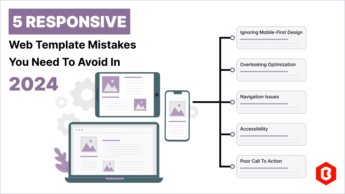
Having a responsive web template can help you succeed and keep your business ahead of the competitio...
In 2023, the worldwide online betting and lottery market size reached $242.04 Billion. To capture a...
Nowadays, every business is operating from an online website which is called a virtual shop. From eC...

In today's digital age, having a strong online presence is no longer a luxury for local businesses -...
As you know nowadays, the craze of Tap-to-earn (T2E) games like Hamster Kombat is beyond expectation...
Related Products 
Not sure which template or UI kit fits your project? Reach out for expert advice.
 100% Satisfaction Guaranteed
  Shop with Confidence!
 Tags
Tags