Buy any 1 product and get 1 absolutely free — this offer applies to all Website Templates, UI Kits, and Complete Scripts.
Buy Now! Article Information
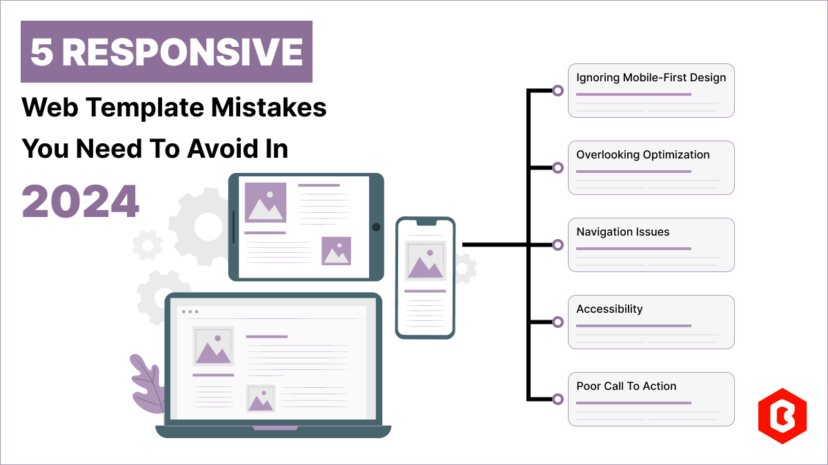
Having a responsive web template can help you succeed and keep your business ahead of the competition. Businesses often make the mistake of not having a responsive website. A non-responsive site can leave a bad impression. Forbes suggests that 88% of users don’t return after a bad experience. Responsive web templates offer an efficient solution. However, you need to be aware of the pitfalls to make your website responsive. This blog will look at 5 common web design mistakes and how to avoid them in 2024.
Around half of all web traffic worldwide today comes from mobile devices. As per Statista, in the last quarter of 2023, mobile phones accounted for 59% of global website traffic. Additionally, search engines such as Google prefer websites that work well on mobile devices. If your website isn't as easy to use on mobile as it is on desktop, it might frustrate visitors and make them leave your site more quickly.
Solution
Choose an optimized responsive web template that adjusts its layout and content based on the screen size, ensuring it looks good on any device.
Ensure to optimize any large images or videos you use to make your site responsive.
Don't assume your website looks good on mobile because it looks fine on your phone. Test it on different devices to make sure everyone gets a good experience.
SEO is important for your website to show up well in search engine results and be easy for users to find. Ignoring SEO can seriously hurt your website's visibility. Without good optimization, your site won't be found easily on search engines when users search for things.
Solution
Find the keywords the audience uses when searching for products or services online. Naturally incorporate keywords into your website’s content, headings, and metadata.
Create high-quality, valuable content that meets your audience's needs and interests, which helps with SEO, engages visitors, and builds trust.
Ensure your website has a clear structure with logical navigation and well-organized content. This helps search engines understand your site and rank it higher in search results.
Check your website’s performance with tools like Google Analytics and Search Console. Track key metrics like organic traffic, rankings, and user engagement to find areas for improvement.
One of the most common web design mistakes is having a poorly organized menu and navigation. It's frustrating to scroll through websites with confusing navigation. If your site has lots of pages, organize them into sections and arrange them in a logical order to make it easier for people to find what they need. Navigation also needs to work well on different devices. For mobiles, a hamburger menu is often used to navigate on small screens. Make sure to compare how navigation looks on mobile and tablet devices.
Solution
Make sure hyperlinks on your website stand out by using a different color, boldface, or underlining.
Sidebars should have a distinct design from the main content to make them noticeable.
Use clear and concise names for hyperlinks. Use evaluation tools to see how users navigate your site.
Avoid animations that roll, bounce, or move while visitors are reading content.
As per WHO, around 1.3 billion people, which is about 16% of the world's population, have significant disabilities. Many website and user journey designers often overlook this. People with farsightedness might need to zoom in on small screens, visually impaired users may prefer audio content, and those with attention deficits might need to pause carousels.
Solution
Always add descriptive alt text to images so users with visual impairments can understand the content.
Use semantic HTML elements to structure your content correctly and improve compatibility with assistive technologies.
Choose high-contrast color combinations for text and background to enhance readability for users with visual impairments.
Utilize accessibility testing tools and assistive technologies like screen readers and keyboard navigation to find and fix accessibility issues on your website.
Another common web design mistake is not having a clear call to action. For a business, a website acts as a funnel for advertising and sales, guiding visitors from prospects to converted clients. If you don't include “clear calls to action” in the right places, you risk losing many potential customers. On the other hand, too much cold calling can annoy visitors.
Solution
Actionable CTAs tell your audience what to do and highlight the benefits of taking action.
Your CTAs need to catch people’s attention, so make them stand out from the rest of your content.
Use contrasting colors and hover animations, similar to your navigation menu elements.
Test different versions of your CTAs to find which one is working. Create various versions and show them to different segments to find out what appeals most to them.
A website is crucial for your growth and to make a great first impression. From picking the wrong colors to using too many animations, a wrong decision can hurt the overall user experience. Follow best practices for website templates that can make your site user-friendly, functional, and effective. However, if you’re looking for responsive web templates, reach out to us today.
 Similar Blogs
In web development, choosing the right CSS framework can make a significant difference in the succes...
As you know, in today’s online world a business website remains the best way to win the custom...
Nowadays, every business is operating from an online website which is called a virtual shop. From eC...
Do you know? The Jewelry Market value is hitting the limit of 310.88 Billion USD in 2024 and by 2028...

In today's digital age, having a strong online presence is no longer a luxury for local business...
Only on Google, every second approximately 99K searches are conducted. Daily this number reaches...

Not sure which template or UI kit fits your project? Reach out for expert advice.
 100% Satisfaction Guaranteed
  Shop with Confidence!
 Tags
Tags