Buy any 1 product and get 1 absolutely free — this offer applies to all Website Templates, UI Kits, and Complete Scripts.
Buy Now! Article Information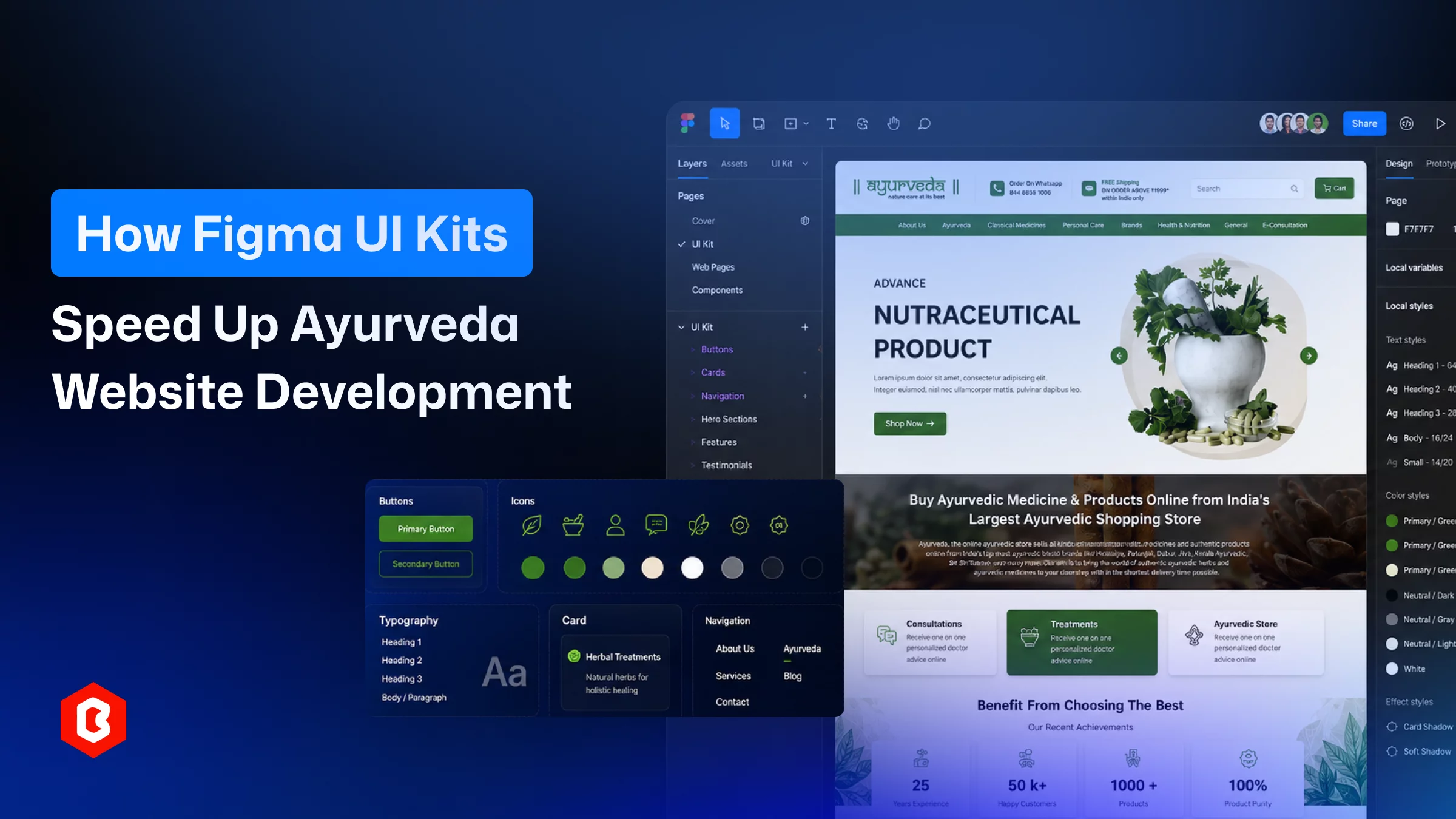
A web designer works on an Ayurveda website design UI Kit, and you’ll hear the same complaint: the brief never quite fits the tools. Clients want the site to feel specific for herbs, terracotta, a certain slowness, along with a working cart, subscription billing, and checkout. You end up designing two products at once and hoping they don't fight each other.
For a long time, the only way through that was starting from scratch. Which meant weeks of layout decisions before anyone even got to the part that made the brand distinctive. That's changed, mostly because of Figma UI kits built specifically for this kind of store. Not generic ayurveda website design e-commerce kits with a green filter slapped on, kits that actually understand what a wellness storefront needs to do.
We’ve sat in enough kickoff calls to know the pattern. A client sends over three competitor sites, none of which quite match what they want, and the design team starts building product cards and checkout flows from zero again. Because there wasn't really a shortcut.
The Ayurveda product category doesn't map cleanly onto standard retail UX. For example, someone selling herbal supplements so they need a way to explain sourcing. Also, presenting lab certifications and a dosage guide is mentioned for a body-type quiz.
None of that exists in a fashion or electronics template. So designers were inventing these patterns on the fly, usually without much time to test whether they actually worked for users.
Designers and developers' collaboration makes website development error-free and complete within the timelines. If a shared component library doesn’t exist, developers feel the “10px spacing” or “button’s hover state” didn't match what the designer meant. Small stuff, but it adds up to time.
A lot of QA time on these projects went to catching visual drift instead of testing whether the checkout actually processed a payment.
Ayurveda brands depend on a fairly specific visual language like muted greens, sandalwood, leaf motifs, a kind of quiet confidence. The empty file usually took time of trial and error before it stopped looking like a stock wellness template.
With all of these, you get long timelines, higher costs, and sites that felt borrowed rather than built for the product.
A dedicated Ayurveda Figma UI kit starts you several steps ahead. You're not opening a blank canvas. You’re opening a system that already has homepage layouts, product detail pages, cart and checkout flows, and, critically, the wellness-specific screens generic kits skip: ingredient breakdowns, herbal remedy guides, consultation booking.
The Ayurveda UI Kit from Theme Bitrix is a decent example of this. The kit is built around the idea that Ayurveda buyers research differently than the average online shopper. As buyers want to know about:
What’s in the bottle
Where it came from
Certification for products
So the UI kit budgets screen space for that kind of trust-building. That's really the difference between a Medical E-Commerce Figma UI Kit built for this category and a generic store template with different colors.
Three things, in practice.
When the core screens already exist as structured components, you're adjusting instead of inventing. Projects that used to take three or four weeks to reach a client-ready prototype can get there in days. That's not about cutting corners — it's that nobody needs to re-solve how an "add to cart" button should behave. That's been solved.
The hours saved go toward the stuff that actually needs original thinking: product storytelling, layout choices specific to that catalog, brand voice.
A well-built kit runs on components and shared styles, not one-off static screens. Swap the palette or the typeface, and it can cascade across the whole file instead of requiring a manual pass through every page. This matters a lot for ayurveda website templates in particular, because two brands selling nearly identical products might want completely different looks. One going for old manuscript and scroll aesthetics, another wanting something closer to clinical and pharmaceutical.
Utilizing the same underlying kit, two very different outcomes, without rebuilding the layout logic each time. The color swap isn’t a good ayurveda website design, but it relates to multiple things:
Icon sets built for herbs and remedies
Illustration styles that read organic instead of sterile
Type pairings that feel trustworthy without looking cold
When developers build off a component-based file, spacing, hover states, and breakpoints are already documented. That reduces QA time: the "is this supposed to have a shadow on mobile" conversations.
The website testing team can invest their time in things that actually matter, like whether the dosage calculator returns the right numbers. They skip visual inconsistencies.
What's the sets apart a Figma UI design kit and a website template?
A UI kit offers only the design with components and screens you customize in Figma before development starts. A template is usually a finished, coded product (WordPress, Shopify, whatever) ready to launch with minimal design work.
Would a generic e-commerce kit work fine for an Ayurveda brand?
It'll get you partway there, but you'll be missing screens for ingredient transparency, dosage info, remedy guides, that kind of thing. An Ayurveda-specific kit already has those built in, which saves the step of designing them under deadline pressure.
Is rebranding a UI kit actually as easy as people say?
Yes. Change color styles and utilize reusable components for a new palette or typeface. The static screens with no real component structure make rebranding closer to redesigning from scratch.
Does starting from a kit limit how original the final site looks?
No. The UI kit gives you structure and patterns that already work. It doesn't dictate imagery, content, or the layout decisions that make a brand distinct. Most of what people notice about a finished site (voice, photography, specific flows) still gets built on top.
How much time does this actually save on a real project?
Common to see core screens go from several weeks down to a matter of days. Fewer QA rounds since spacing and component states are already defined before a developer touches the file.
 Similar Blogs
Designing and developing a website may look tough and time-consuming. It is actually tough when it c...
Purchasing UI kits online minimizes a business’s efforts in designing websites or apps. We can consi...
In web development, choosing the right CSS framework can make a significant difference in the succes...
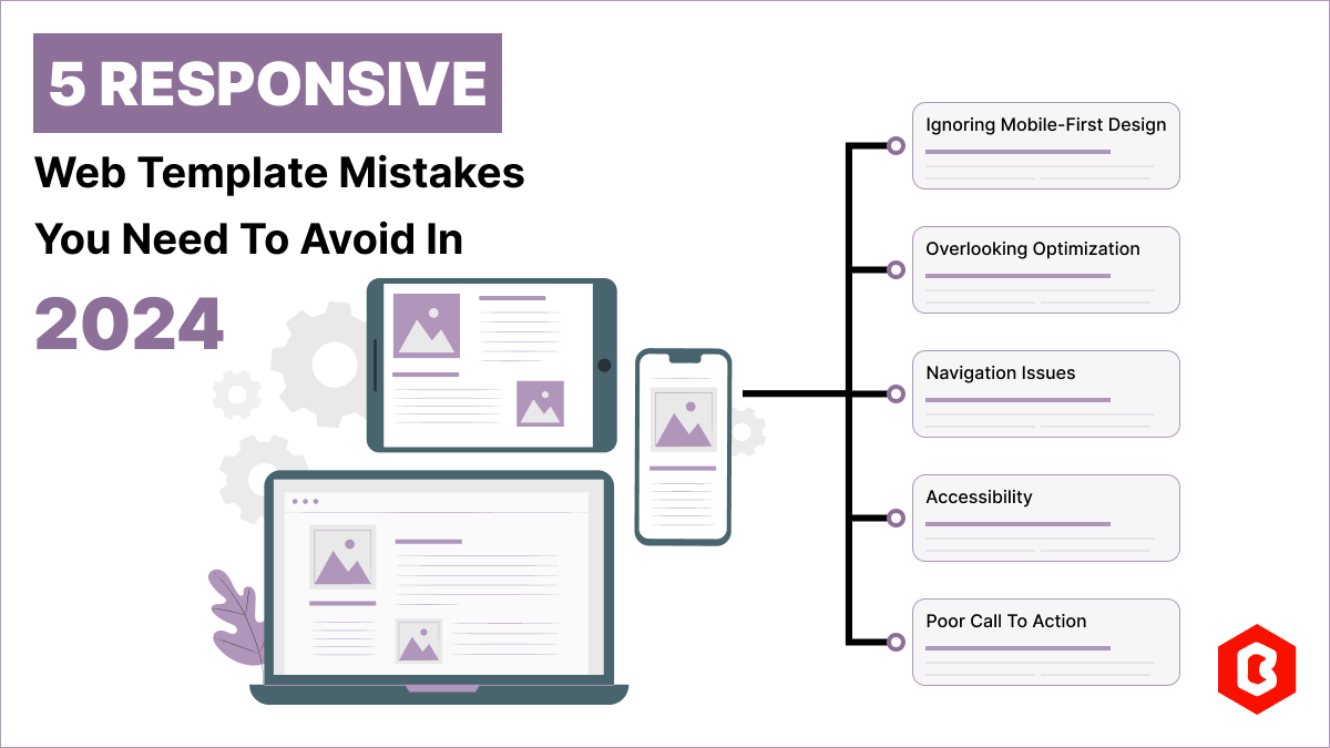
Having a responsive web template can help you succeed and keep your business ahead of the competitio...
Nowadays, every business is operating from an online website which is called a virtual shop. From eC...

In today's digital age, having a strong online presence is no longer a luxury for local businesses -...
Related Products 

Not sure which template or UI kit fits your project? Reach out for expert advice.
 100% Satisfaction Guaranteed
  Shop with Confidence!
 Tags
Tags