Buy any 1 product and get 1 absolutely free — this offer applies to all Website Templates, UI Kits, and Complete Scripts.
Buy Now! Article Information
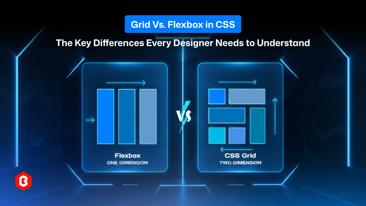
CSS has come a long way. Gone are the days when designers and developers depend on floats, clearfix hacks, or absolute positioning to build layouts. Today, two layout systems, CSS Grid and CSS Flexbox, give us powerful, flexible, and predictable ways to build modern, responsive user interfaces.
Yet many designers still struggle with a fundamental question: When should you use Grid vs. Flexbox?
This blog will answer this question. You will know what each system does in website development, but also how they differ, where each shines, and how to combine them to make maintainable and responsive layouts. Whether designing a simple card layout, a complex dashboard, or a full-page UI, knowing Grid vs. Flexbox is essential for every UI/UX designer’s toolkit.
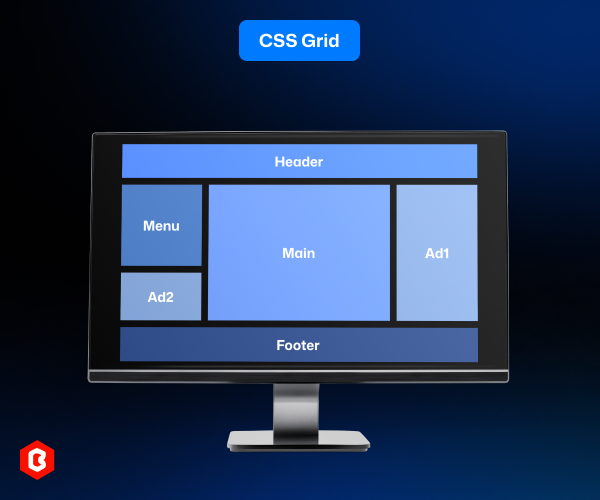
The CSS Grid Layout is a two-dimensional layout system built into CSS that lets you control rows and columns simultaneously. It is designed for structuring complex layouts. Whether that’s a full page, a multi-column layout, a gallery, or a dashboard.
With Grid, you declare a container as a grid (display: grid) and define the structure via properties such as grid-template-columns, grid-template-rows, and optionally gap. Child elements are then placed into this structure, either automatically or explicitly.
Grid treats layout in both dimensions. But, particularly useful for the following:
Full-page layouts (header, sidebar, main, footer).
Multi-column layouts (articles, marketing pages, dashboards).
Complex UI arrangements (cards, galleries, overlapping items).
In short, CSS Grid gives you a blueprint, a rigid but complete structure. It lets you design with proper intent.
CSS Flexbox (Flexible Box Layout) is a one-dimensional layout model that manages layout along a single axis, either horizontally (row) or vertically (column). Rather than defining a rigid grid, Flexbox lets items flow and adapt based on their content and the available space.
You turn any container into a flex container by setting display: flex. You can use properties like flex-direction, justify-content, align-items, flex-wrap, and order to control how child elements are laid out.
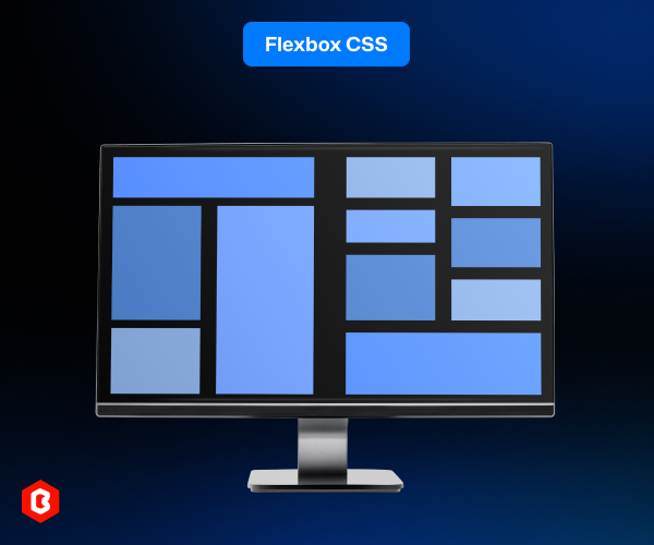
Flexbox excels when dealing with smaller UI components. For example:
Navigation bars
Button groups
Inline content alignment
Flexible card rows
Adaptable layouts where content size is dynamic
Because Flexbox is content-driven and flexible, it’s a natural fit when you don’t know exactly how your content will be presented on devices. That’s why it adapts to many UI components and interface elements.
To know what each is optimized for and where one wins over the other, let’s break down the fundamental differences between Grid and Flexbox.
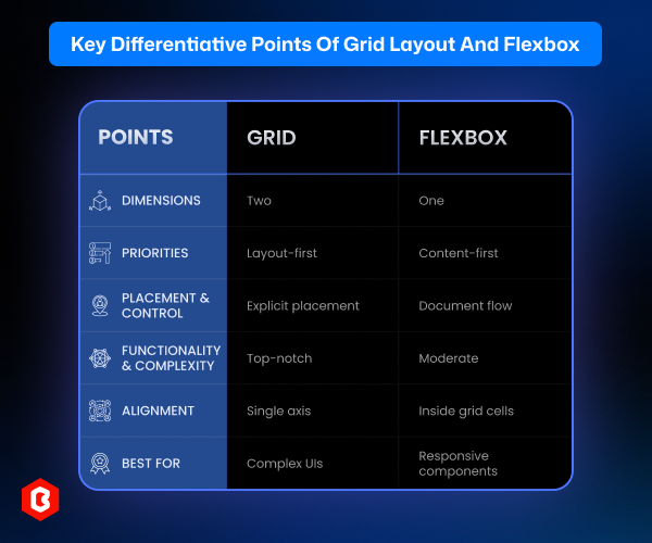
Grid = Two Dimensions: Grid operates in both rows and columns simultaneously. It’s perfect when you need a structured layout across both axes.
Flexbox = One Dimension: Flexbox arranges items along a single axis, either row or column. It’s ideal for simpler layout needs along that axis.
Implication for design:
Use Grid when your design requires control on both axes, e.g., a multi-column page or dashboard. Use Flexbox when items should flow in a single line or axis, like navigation menus, buttons, or lists.
Flexbox is content-first. Layout adapts to content size. Elements flex, shrink, or wrap, depending on their intrinsic size and container constraints.
Grid is layout-first. You define the layout structure (columns/rows) first; content fills into that structure. You control the interactive relationships explicitly.
Implication for design:
If content is dynamic or unpredictable (e.g., user-generated text, lists, varying components), Flexbox gives flexibility. If the layout needs to remain consistent regardless of content (e.g., template, gallery, dashboard), Grid is preferable.
Grid allows explicit placement. You can place items on specific grid lines or named grid-areas, overlap items, or reorder visually without changing markup order.
Flexbox relies on document flow. Items flow in order (unless you use order), and placement is linear. Flexbox doesn’t inherently support overlapping or complex two-axis arrangements.
Implication for design:
For editorial layouts, overlapping card designs, or complex UI where you want precise control, Grid is unmatched. For linear components and elements where flow and responsiveness matter more, Flexbox is simpler and effective.
Grid features: In Grid features are available row and column definitions, gaps, explicit and implicit tracks, named areas, overlapping, and complex layout control.
Flexbox features: In Flexbox, the features include item alignment, wrapping, ordering, flexible sizing, easy centering, and being intuitive for small-scale layouts.
Implication for developers/designers:
Grid introduces more complexity (especially for advanced layouts), but provides powerful layout capabilities. Flexbox remains simpler often enough for many layout tasks. Using both appropriately is the best approach.
Both Grid and Flexbox offer alignment options (justify-content, align-items, align-self, justify-self, etc.), but how they apply differs:
Flexbox’s alignment: It aligns items along the container’s single axis (main) and cross-axis, with straightforward behavior for item flow.
Grid’s alignment: It allows precise alignment inside grid cells, across rows and columns, offering more comprehensive control for two-dimensional layout.
Implication for design:
When you need to align items across both axes or align within a structured grid, Grid gives better control. For simple horizontal or vertical alignment, Flexbox remains intuitive.
Grid lets you define fixed or fluid tracks, gaps, explicit placement, and rearrange items for different breakpoints. It is great for complex UIs.
Flexbox naturally adapts to content changes, supports wrapping, and flexible sizing. It is proper for responsive components like menus, cards, and inline items.
Implication for design:
For complex layouts that must remain consistent across breakpoints, Grid works. For elements or components that need to flex and flow naturally, go with Flexbox.
Here are the scenarios where CSS Grid truly shines:
Building full-page layouts: header, sidebar, content, footer
Multi-column article pages, dashboards, data-heavy interfaces
Galleries, card grids, photo grids, product listings
Complex layouts with overlapping or non-linear structure
Responsive layouts needing explicit control of columns and rows using fr, minmax(), and media queries
Template-based design systems where layout consistency matters
Grid is particularly suited when design demands structure, precision, and scalability.
Flexbox is most useful when:
Laying out simple one-dimensional components (navbars, toolbars, button groups)
Aligning items horizontally or vertically (centering, spacing)
Creating flexible, content-driven UI elements where item size may vary (tags, badges, inline lists, card rows)
Building components where content flow, wrapping, and responsiveness matter more than strict grid alignment
Quick layout tasks within a larger structure (e.g. list of cards inside a grid cell)
Flexbox is fast, intuitive, and ideal for small to medium-scale layout management.
Let’s take a moment to highlight what truly distinguishes each and why they aren’t interchangeable but complementary.
Full two-dimensional control: You get rows and columns set up at once.
Explicit layout over content: You define where content goes, not the other way around.
Layout consistency: Regardless of content variations, the structure remains fixed.
Precise item placement: It includes grid areas, line positioning, overlapping, and advanced layout patterns.
Ideal for macro-level design: The page structure, dashboards, complex UIs, gallery grids, and more.
Content-driven flexibility: The items adapt to content size and container space.
Simple, intuitive syntax: It is easy to implement and reason about for linear layouts.
Great for UI components: The navigation, buttons, lists, cards, and small-scale UI elements are optimized.
Responsive behavior: Anything from wrapping, dynamic sizing, reordering, and alignment makes it ideal for flexible UI.
Ideal for micro-level design: The components and interface elements within a larger layout.
In real-world website UI/UX design, the question shouldn’t be “Grid or Flexbox,” but rather “When to use Grid and when to use Flexbox and how to combine them.”
A common pattern includes the following:
Use Grid to define the overall page layout, like header, sidebar, content, and footer.
Inside those sections, use Flexbox to align and distribute elements, including navigation links, buttons, cards, lists, etc.
This hybrid approach lets you benefit from structured, responsive layouts (Grid) while retaining flexibility and simplicity at the component level (Flexbox). Using both together results in cleaner, more maintainable, and more adaptive CSS.
Understanding Grid vs Flexbox in CSS isn’t an academic exercise. It’s a practical tool for every UI/UX designer and front-end developer building real-world interfaces.
Rather than seeing Grid and Flexbox as rivals, treat them as complementary tools. When used properly, they bring clarity, maintainability, and scalability to your UI, while keeping your CSS clean and your layout predictable.
What is the main difference between CSS Grid and Flexbox?
CSS Grid is a two-dimensional layout system that controls rows and columns simultaneously, while Flexbox is one-dimensional, aligning elements along a single row or column. Grid defines the layout first; Flexbox adapts to content size.
Can I use Grid and Flexbox together?
Yes. Most modern interfaces use Grid for page structure and Flexbox for inner components. Combining both gives cleaner, more scalable, and more maintainable layouts.
Which is more responsive, Grid or Flexbox?
Both are responsive, but Grid is better for complex, multi-row layouts, while Flexbox is superior for flexible, content-driven components that need to adapt naturally.
Which is better for alignment: Grid or Flexbox?
Flexbox provides easier horizontal and vertical alignment within a single row or column. Grid provides more precise alignment across both axes inside structured cells.
Should I use Grid for small components?
Generally no. Flexbox is more efficient and requires less code for component-level design, like toolbars, cards, and form inputs.
 Similar Blogs
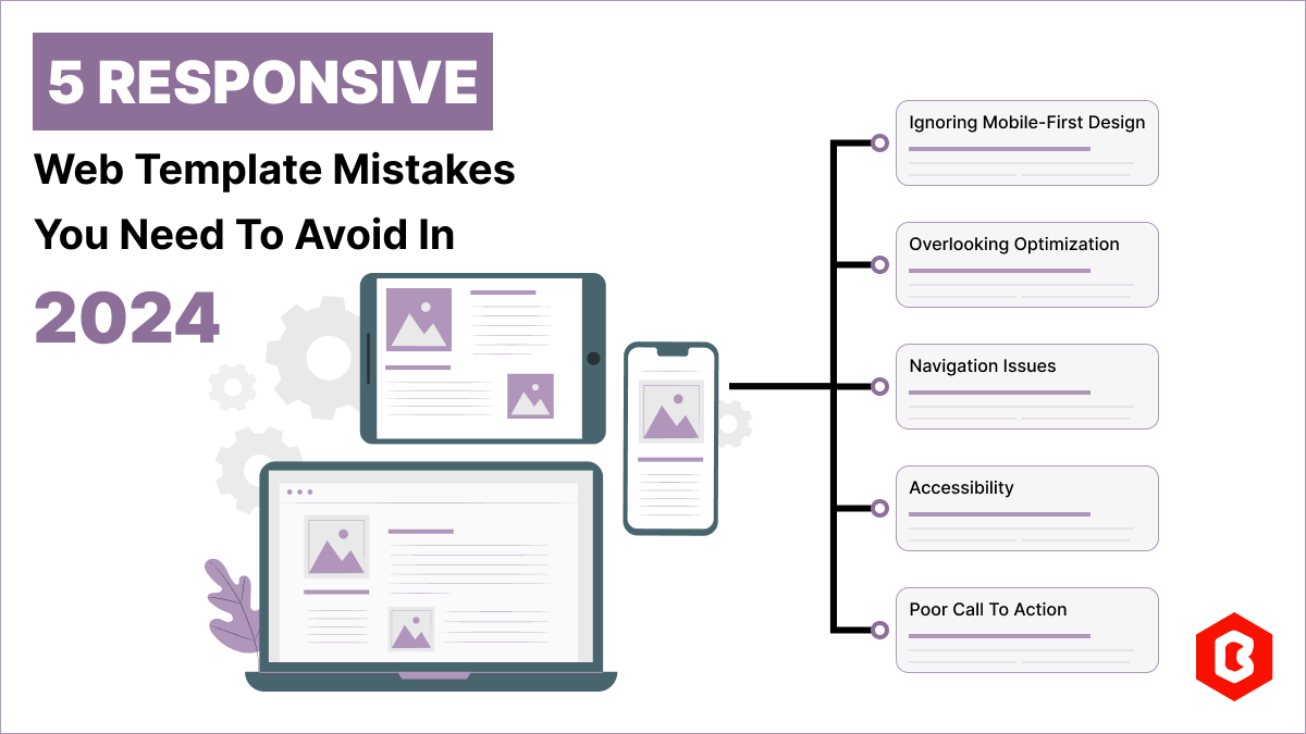
Having a responsive web template can help you succeed and keep your business ahead of the competitio...

Today everything seems to be online whether it's an eCommerce store or a stock broker mobile app...
Having an interactive and functional website is a core aspect of making a successful online business...

In 2023, the worldwide online betting and lottery market size reached $242.04 Billion. To capture...

In today's digital age, having a strong online presence is no longer a luxury for local business...

Only on Google, every second approximately 99K searches are conducted. Daily this number reaches...

Not sure which template or UI kit fits your project? Reach out for expert advice.
 100% Satisfaction Guaranteed
  Shop with Confidence!
 Tags
Tags