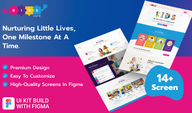
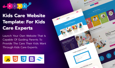
Buy any 1 product and get 1 absolutely free — this offer applies to all Website Templates, UI Kits, and Complete Scripts.
Buy Now! Article Information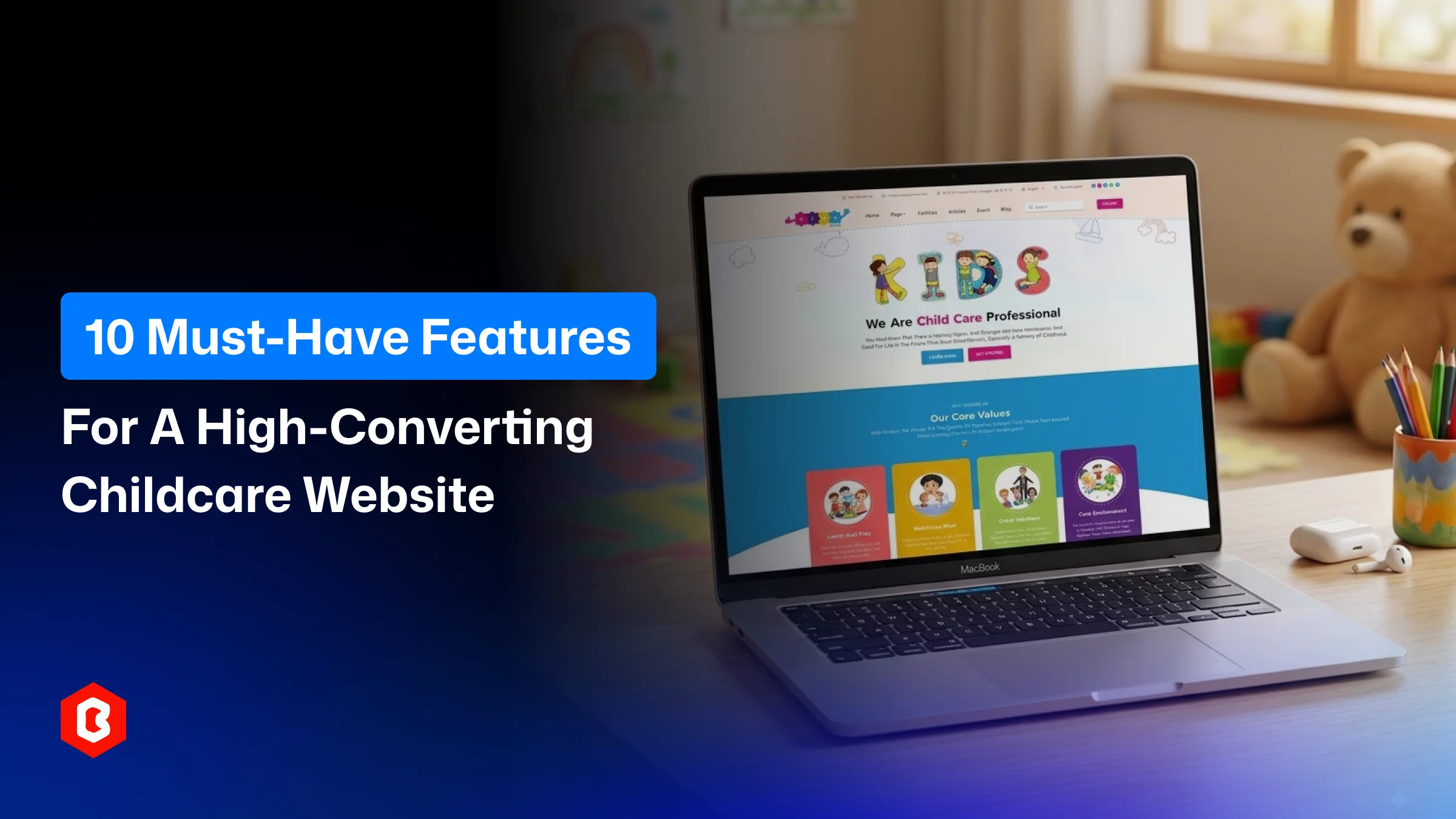
Here's something most daycare owners don't think about until it's too late: a parent will judge your entire business in the time it takes to load your homepage. Not your curriculum. Not your years of experience. Your website.
You may feel it sounds harsh. But think about it from the parent’s side for a second. They're about to leave their kid with someone else for eight hours a day. They're nervous, they're comparing three or four places at once, and they're doing most of that comparing at 11 pm on their phone after the kids are finally asleep. If your site takes forever to load, or it's impossible to tell what age groups you accept, or there's no way to actually book a tour without picking up the phone. They’re gone on to the next tab.
This is really the whole argument for treating your childcare website as more than a digital brochure. Whether you're setting up a new preschool, running an independent babysitting service, or finally replacing that nursery website your cousin built you in 2015, the site needs to do actual work: build trust fast, answer the questions parents are too polite to ask out loud, and make it stupidly easy for them to say yes.
Below are 10 features we’d consider non-negotiable when choosing a nursery, babysitting, or Childcare website template. Some of these are obvious once you hear them. A few are the kind of thing that gets skipped because "we'll add it later," and later never comes.
Whenever you ask a freelancer to build a nursery website for preschool or hire a web development agency to do so, keep prioritizing these features:
This is the first feature we can say. Here, you don’t get long. As a website development agency, we analyzed that visitors have only a few seconds to decide whether to keep scrolling or hit the back button on their mobile phone. So the top of your homepage needs to do multiple things:
A real photo (not the same stock image every daycare in the country seems to use)
A straightforward line about what you actually offer
A button that's impossible to miss: "Book a Tour," "Schedule a Visit," something with an obvious next step
Skip the cute, vague taglines. Parents scanning at midnight want facts: what ages you take, roughly where you're located, and what makes you different from the place down the street.
Most of your visitors are going to be on their phones, full stop. Parents don't usually sit down at a laptop to research daycare. They’re doing it in the school pickup line, on a lunch break, wherever they can grab five minutes. If your site was built for desktop first and just kind of squeezed onto mobile, you'll see it in tiny buttons, text that wraps weird, and forms that are a pain to fill out with your thumb.
Utilizing the genuinely responsive template is one that reshapes itself properly for whatever screen it's on. It isn't a nice-to-have anymore. Surprisingly, there's a search ranking benefit too, since Google favors mobile-friendly user experience sites when deciding what shows up first.
Nobody wants to read three paragraphs to find out if you even take infants. So, what does to opimize? We recommend that you give each daycare program its own page:
Infant care
Toddlers
pre-K
After-school
Lay out the schedule
The rations
What a typical day looks like
Cost estimates (including taxes and other fees, charges)
If parents find their kid’s age group in two clicks, they generally have a "yes, this could work" moment a lot faster. That means they don’t have to hunt through a wall of text. That's really the whole point for childcare enrollment.
This one's the biggest missed opportunity we see during the website development for childcare. So many childcare sites make their entire conversion process a phone number. But a parent who's finally decided to reach out at 9:45 pm doesn't want to remember to call during business hours. They only want to act right then, while they're still motivated.
You can depend on any amount of polished copywriting. A simple form where they pick a program, see what's available, and submit their info does more for your enrollment numbers. Momentum matters, and phone tag kills it.
There's a reason people scroll straight past marketing copy but stop to read a review. Hearing from another parent, especially with a name, a photo, maybe a video, does something a bulleted list of features can't. It says "someone like you already trusted this place, and it worked out." Put a few of these near your contact form or booking button, not buried on a separate page nobody visits. It's a small thing that quietly does a lot of the persuading.
Safety is the thing every parent is worried about in daycare centers, and almost nobody asks directly. So answer it before they have to. Photos of the actual classrooms and child play areas, a mention of how sign-in and sign-out work, your staff-to-child ratios, any licensing or accreditation you hold- put it all in one place. This page does more quiet reassurance than almost anything else on the site, mostly because it shows rather than tells.
An events section: holiday celebrations, field trips, parent visiting days signals that your center is alive and active, not a website someone built once and forgot about. Pair that with a page on the activities and curriculum you run day to day, so parents can see there's more going on than supervision. This combination does a good job of implying "your kid will actually enjoy their time here," which is honestly half the sale.
We get the skepticism. A blog on a daycare website sounds like overkill. But it earns its keep two ways.
First, it answers the practical stuff parents are Googling before they ever find you. This includes what to pack for the first day, how enrollment actually works, what the fee structure looks like.
Second, every post you publish is another chance for search engines to send someone your way.
Centers that keep a blog updated tend to quietly outrank the ones running a static five-page site, even if the design looks similar. This is called a combination of SEO and content marketing strategy that brings qualified calls to your nursery school.
Parents comparing a few centers in one sitting don't have patience for a confusing menu. Keep it simple and maintain hierarchy like: Home, Programs, Facilities, Blog, and Contact. Add a search bar so someone can just type "pricing" or "infant care" and get information. They can skip the guesswork.
The less friction in getting around your site, the more pages an actually-interested parent will look at before reaching out to you.
By the time someone reaches your contact page, they're close to enrolling the child in a nursery program or babysitting services. Don't lose them here with a ten-field form or a phone number that's not clickable. It’s not a good practice in terms of enrollment conversion on the website.
Keep the form short, add a click-to-call number, maybe a WhatsApp option if that's how your area communicates, an embedded map, and your actual hours. This works better for conversion on a daycare website.
If you run more than one location, give each its own contact details instead of funneling every inquiry into one generic inbox.
These features are laying the foundation of a childcare platform's success, and the good news is that they’re available in pre-built website templates.
At Theme Bitrix, we didn't come up with this list in a vacuum. It’s built into our childcare website template because we kept seeing the same gaps on real daycare and nursery sites. Rather than asking you to add these features on later (which rarely actually happens), they're already there.
Our childcare website template ships with age-based program pages and package-style pricing, so parents can compare options side by side without emailing you first. There's an events section built in for showcasing holidays and school activities, plus a dedicated activities page for your curriculum and extracurriculars. A blog is already set up and ready for you to start publishing, no separate plugin or workaround needed.
The trust-building side is covered too: a testimonials section, a facilities page, clear buttons throughout the site instead of buried contact links, and a straightforward booking flow for classes.
The template is fully responsive. So, anyone seeing it on the phone just as well as on a desktop, and it's built with clean code that loads quickly. This matters both for parents’ patience and for your search rankings, too. There's a working search bar as well, so navigation isn't left to chance for abandoning the childcare program enrollment.
The template is built on Tailwind CSS and Bootstrap. That means you can restyle colors, fonts, and layout to match your brand without touching a line of custom code. Even if it can be done without hiring a developer just to change a button color. For that, you need basic technical knowledge regarding web technologies.
We can say that instead of spending weeks assembling these ten features one by one, you get a template that already has the reflection of a high-converting childcare site. You just make it yours.
None of this is about chasing web design trends or making your site "look modern" for its own sake. The goal is to clarify every reason that makes parents nervous and wastes their time that leads to close your website. The enrollment never happens.
A homepage that builds trust fast, a mobile layout that actually works, real testimonials, honest safety information, and a contact process with nothing in the way. Each page does a specific job in getting someone from "just browsing" to "we booked a tour for childcare center."
Look for a premium childcare website template instead of a free one. It can help to build the new site or redevelop the existing one. It'll save you weeks of working with a developer multiple times and look more credible to parents from day one. The part that actually matters for your business. Turn more visitors into enrolled families.
Honestly, trust. Trust reflects on a daycare website from a clear homepage, visible safety details, and real testimonials from other parents.
Yes. Most parents are browsing on their phones, outside business hours. To improve calls for nursery school enrollment mobile optimized website work usually better.
Focus on four things: 1. A blog or resource section, 2. Clean and fast-loading code, 3. Proper heading structure, and 4. Mobile responsiveness.
Generally yes. It should be flexible enough for customizable programs, pricing sections, and content areas.
First of all, ask only for essential information in the contact form. Then, add clear buttons on every page, and put testimonials and safety details near wherever someone would submit an inquiry.
For most people, a template designed specifically for childcare businesses gets you there faster and cheaper if you have sufficient technical knowledge.
 Similar Blogs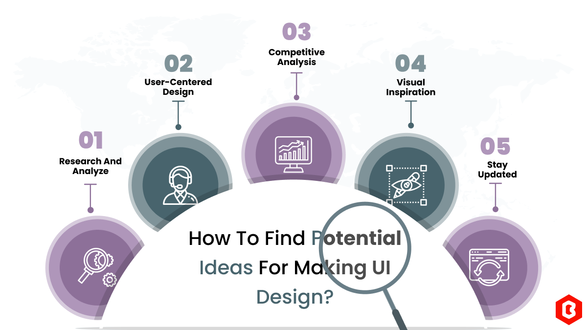
We can discover a lot of alternatives when it comes to UI design or UI thoughts, which we are able t...

UI/UX. User interface and Use experience are the two important things we can consider in today’s web...
Designing and developing a website may look tough and time-consuming. It is actually tough when it c...
Having an interactive and functional website is a core aspect of making a successful online business...
When the world is going online, having a responsive website that works flawlessly across all devices...
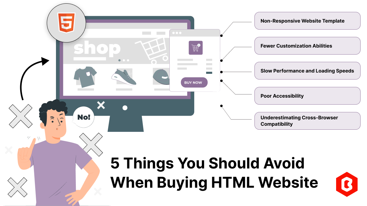
According to stats published on Forbes, 57% of internet users avoid recommending a poorly designed w...
Related Products 
Not sure which template or UI kit fits your project? Reach out for expert advice.
 100% Satisfaction Guaranteed
  Shop with Confidence!
 Tags
Tags