Buy any 1 product and get 1 absolutely free — this offer applies to all Website Templates, UI Kits, and Complete Scripts.
Buy Now!
Design trends change fast. A website UI that looked modern two years ago can feel outdated now. Still, many websites repeat the same small mistakes. This happens a lot, especially when people focus too much on how things look and forget how people actually use a website.
Let’s go through some common mistakes. Not theory, just real things you’ll notice if you observe how users behave.
Sometimes websites try so hard to look trendy that they forget to be usable. You’ll see oversized text, strange layouts, and weird scrolling effects. It looks cool for a second, but then it gets confusing.
In many cases, users don’t care about trends. They just want to find information quickly. If your website UI makes people think too much, they leave. Simple as that. A clean web UI design is not boring. It just means things are easy to understand. There’s a difference.
This is one of those things most people don’t notice, until it feels wrong. Bad spacing makes a website feel messy, even if the design is technically “good”.
Here are a few common spacing issues:
Elements too close together: Buttons, text, and images feel cramped. It makes everything harder to read and click.
Too much empty space in random places: Some sections feel empty while others feel crowded. There’s no balance.
Inconsistent padding: Different sections have different spacing rules. It breaks the visual flow.
Text alignment issues: Slight misalignment can make a website UI feel unprofessional.
No clear visual hierarchy: Everything looks the same size, so users don’t know where to focus.
A good UI design doesn’t just depend on colors and fonts. Spacing plays a huge role, even if it’s subtle.
People don’t want to explore your website like a puzzle. They want clear paths. Sometimes websites add too many menu items, dropdowns, categories, and hidden sections. It feels like everything is important, which actually makes nothing stand out.
A simple observation: If someone has to think “where should I click next?”, something is wrong.
Good navigation usually feels obvious. You don’t even notice it because it just works. Using a well-structured UI kit can actually help here. Many Figma UI kit designs already follow tested navigation patterns. You don’t have to reinvent everything.
This still happens more than you’d expect. A website might look perfect on a laptop, but then you open it on your phone, and things fall apart. The buttons are too small. Text is too large. Sections don’t fit properly. In real life, most users are on mobile now. Not desktop. So ignoring mobile-friendly web UI design is a big mistake.
A few things that usually go wrong:
Content doesn’t stack properly on smaller screens
Touch areas are too small
Images don’t resize correctly
Navigation becomes hard to access
Important buttons get pushed too far down
A good website UI should feel natural on every screen. Not just one.
This one is very common when people mix different resources. You take a button from one UI kit, a card from another, some icons from somewhere else, and suddenly the whole design feels inconsistent. It’s not always obvious why it feels off, but it does.
Different styles create small visual conflicts:
Buttons have different border styles
Fonts don’t match properly
Icons feel like they belong to different apps
Colors don’t follow a system
Components behave differently
Using a single, well-structured Figma UI kit can solve most of this. It keeps everything consistent from the start. Consistency in UI design builds trust. Users may not say it, but they feel it.
A website can look beautiful and still fail. This happens more often than people think. Some designs focus heavily on animations, colors, and visuals. But basic things like loading speed, readability, and usability get ignored.
Quick reality check:
If a page loads slowly, people leave
If the text is hard to read, people skip it
If buttons are unclear, people don’t click
Simple things matter more than fancy things. A good web UI is not just about design. It’s about how easily people can use it. In many cases, removing unnecessary design elements actually improves performance and user experience.
This is probably the most overlooked mistake. Designers often assume they know how users will behave. But real users are unpredictable. Something that feels obvious to you might confuse someone else.
Small observation: Most people don’t read carefully. They scan. They click quickly. They make fast decisions. So if your website UI depends on users “figuring things out”, it may not work well.
Testing doesn’t have to be complicated:
Ask a few people to use your website
Watch where they get stuck
Notice what they ignore
See what they click first
Ask simple questions like “Was anything confusing?”
Even basic feedback can reveal things you didn’t notice.
Web design in 2026 is not about doing more. It’s about doing the right things. A clean, simple, and consistent web UI design usually works better than something overly creative but confusing. Most mistakes don’t happen because of a lack of skill. They happen because of small decisions that seem harmless at first.
Using a good UI kit, especially a well-designed Figma UI kit, can reduce a lot of these issues. It gives you a solid starting point instead of guessing everything. At the end of the day, users don’t care how much effort went into your design. They care about how easily they can use it. And that’s what really matters.

In web development, choosing the right CSS framework can make a significant difference in the succes...
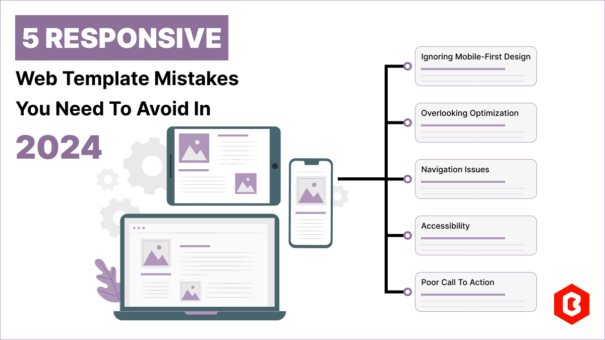
Having a responsive web template can help you succeed and keep your business ahead of the competitio...
Nowadays, every business is operating from an online website which is called a virtual shop. From eC...

In today's digital age, having a strong online presence is no longer a luxury for local business...

Only on Google, every second approximately 99K searches are conducted. Daily this number reaches...

Having a website has become necessary for all sizes of businesses in this digital world. Whether you...

Not sure which template or UI kit fits your project? Reach out for expert advice.