Buy any 1 product and get 1 absolutely free — this offer applies to all Website Templates, UI Kits, and Complete Scripts.
Buy Now!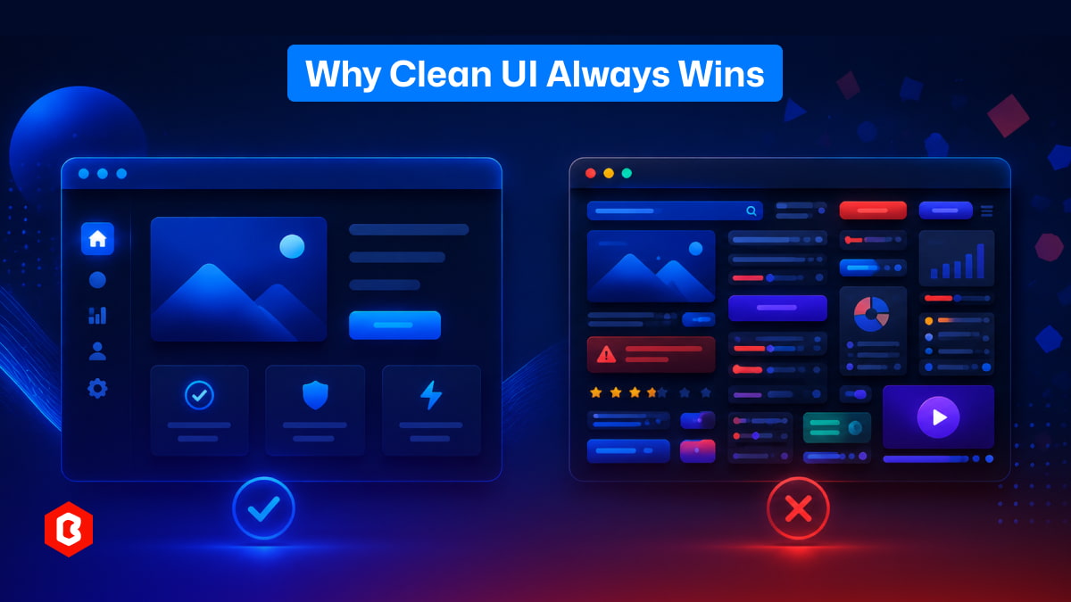
There’s something interesting about how people use apps and websites.
They don’t read everything. They don’t try to understand every feature. Most of the time, they just want things to work fast and feel easy. This is where clean UI quietly does its job… and messy design starts creating problems.
Most people decide in a few seconds whether they like a website or not. This happens a lot, even if they don’t realize it.
A clean UI feels calm. You open a page, and your eyes don’t struggle. You know where to look. Buttons are clear. Text is readable. Nothing feels out of place.
But with a messy design, things feel confusing almost instantly. Too many colors, too many elements, or random layouts make the brain work harder. And honestly, people don’t want to work that hard just to use a website.
In many cases, users leave without even knowing why they felt uncomfortable.
Clean UI is not about removing everything. That’s a common misunderstanding.
It’s more about organizing things properly. Giving space where needed. Keeping only what matters visible.
Here’s what usually makes a UI feel clean:
When things are not cramped together, it becomes easier to scan. People can quickly understand what belongs where without thinking too much.
Using too many styles creates confusion. A limited set makes everything feel connected and predictable, which helps users feel comfortable.
Important actions should stand out. If users have to search for a “Buy” or “Submit” button, something is already wrong.
Users should not feel lost. Menus and paths should feel obvious, even for someone visiting for the first time.
Not everything needs attention. When everything tries to stand out, nothing actually does.
Clean UI design is quiet. It doesn’t try too hard, and that’s exactly why it works.
This is something many designers don’t notice at first.
Messy UI doesn’t happen because someone wants it to be bad. It usually starts with adding “just one more thing.”
A new feature here. A banner there. Maybe another color to make something “pop”. Slowly, the screen gets crowded.
At some point:
There are too many buttons
Too many sections fighting for attention
Too many ideas on one screen
And now, instead of helping users, the design starts confusing them.
This happens a lot in growing products. Every update adds something, but nothing gets removed or simplified.
Let’s be honest. Most users are not trying to study your interface. They just want to complete a task.
Order something
Fill a form
Check information
Move to the next step
That’s it.
If they have to pause and think, “What should I do next?”, the design has already failed a bit.
Clean UI reduces this thinking effort. It guides users naturally, almost like they are being led without noticing it.
Messy UI does the opposite. It creates small moments of confusion again and again. And these small moments add up.
People don’t complain much. They just leave. This is important.
Most users won’t send feedback saying, “Your UI is messy”. They will simply close the app or switch to another option.
So sometimes, businesses think everything is fine because no one is complaining. But the problem is hidden in user drop-offs.
Clean UI quietly keeps users. Messy UI quietly pushes them away.
Sometimes it’s not obvious. But there are small signs.
If people frequently ask how to use something, the design is not guiding them properly.
When everything looks important, users don’t know what actually matters.
If each page feels different, users have to “re-learn” the interface again and again.
Tasks that should take seconds end up taking much longer.
Adding features feels productive, but simplifying often creates better results.
These issues don’t appear suddenly. They build up over time.
Some people think clean UI is only about appearance. But it goes deeper than that. It affects how people behave.
When UI is clean:
Users feel more confident using the product
They complete tasks faster
They make fewer mistakes
They stay longer without frustration
In many cases, even small improvements in UI clarity can increase conversions. A cleaner layout can make a checkout process feel easier, even if nothing else changes.
It’s not magic. It’s just better communication.
There’s a small trap here. Designers as well as developers spend a lot of time with the software. They understand everything. So they don’t feel the confusion that new users feel.
Because of that:
Extra features don’t feel overwhelming to them
Complex layouts don’t seem confusing
Navigation feels “obvious” (but only to them)
But for a new user, it’s a completely different experience. This gap between creator and user is where messy UI often grows.
This part is not easy. To keep a UI clean, someone has to say no:
No to unnecessary features
No to extra design elements
No to clutter that doesn’t add real value
This doesn’t mean ignoring ideas. It means choosing what truly matters. In many cases, removing something improves the experience more than adding something new.
If a person sees your interface for the first time and understands it without explanation, that’s a good sign. If they need guidance, tooltips, or instructions just to get started, something is off.
Clean UI feels natural.
Messy UI feels like work.
Good design is often invisible. When a UI is clean, people don’t notice it much. They just use it and move on. Everything feels smooth. But when design is messy, it becomes very noticeable. Not in a good way. So in a way, success in UI design is not about standing out. It’s about not getting in the way. And that’s why clean UI keeps winning, again and again.

Today everything seems to be online whether it's an eCommerce store or a stock broker mobile app...

Having an interactive and functional website is a core aspect of making a successful online business...
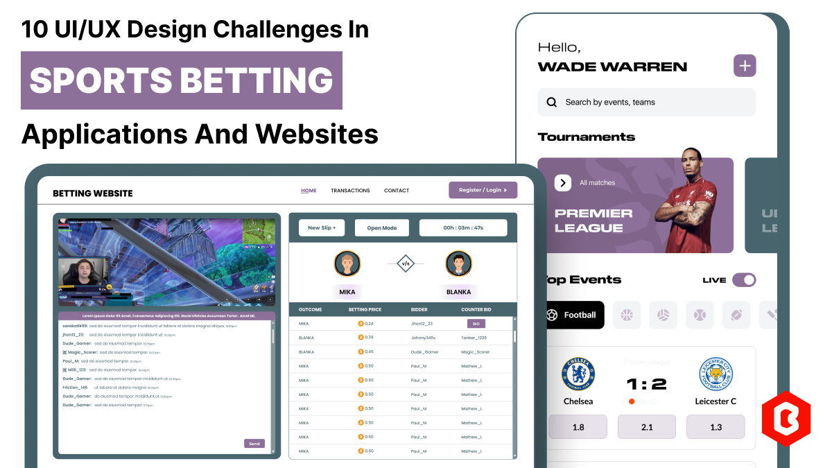
In 2023, the worldwide online betting and lottery market size reached $242.04 Billion. To capture...

Have you ever played and learned about the best experience for exciting mobile gaming? So, welcome H...
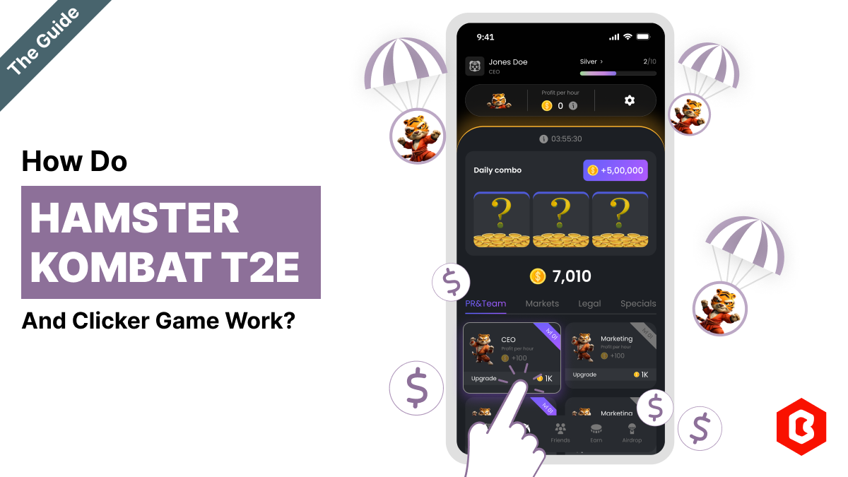
The world of gaming has thrown some curveballs our way, but Hamster Kombat might just be the most ad...
Have you heard about the Hamster Kombat game? A revolutionary Web3 game that gets 239 million users...

Not sure which template or UI kit fits your project? Reach out for expert advice.