Buy any 1 product and get 1 absolutely free — this offer applies to all Website Templates, UI Kits, and Complete Scripts.
Buy Now!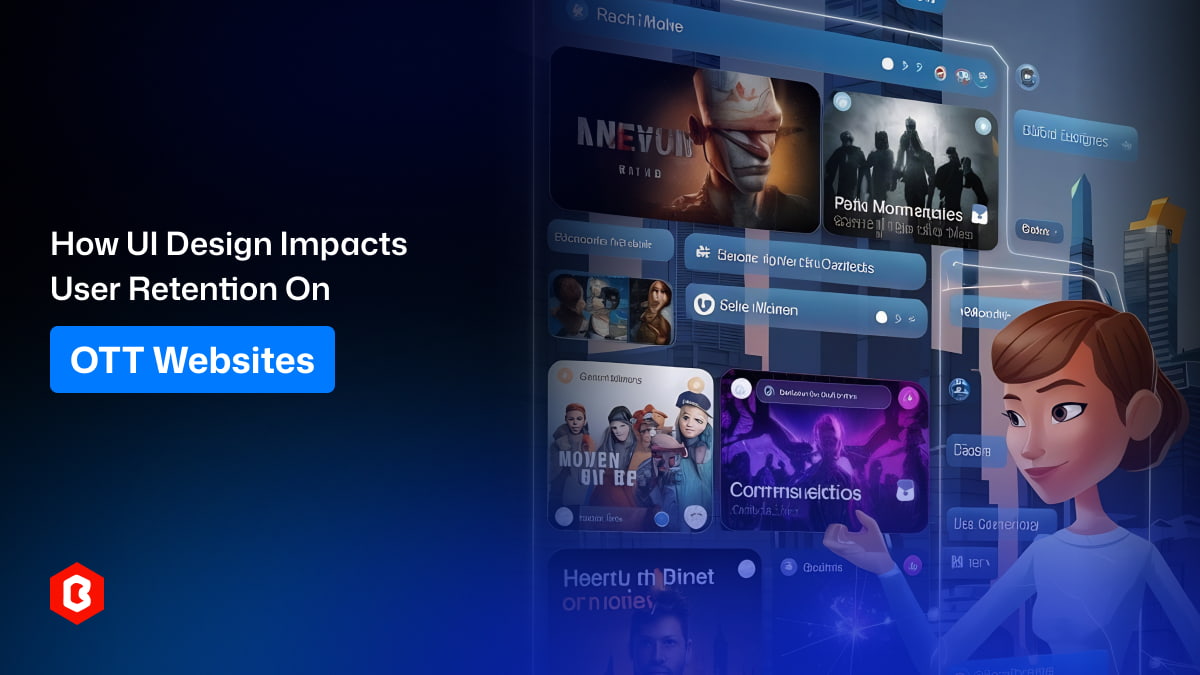
When you run an OTT (Over-The-Top) streaming platform, understanding how your users use your website is quite necessary. If you ignore the design and layout, you are essentially making it harder for people to watch the content they are paying for. In the streaming world, every platform is fighting for the same thing: the user’s time. Many websites offer similar movies, shows, and subscription plans. By focusing on your UI (User Interface) design, you can make sure users stay on your site longer instead of switching to a competitor. Here, we will discuss several important ways that UI design impacts user retention.
A good UI design helps users find what they want to watch without any frustration. When you have thousands of movies and shows, it is easy for a user to feel lost. If your website is cluttered or the search bar is hard to find, people will leave. UI design is about making the journey from "opening the site" to "pressing play" as short as possible.
Clear Categories: Organizing shows into simple groups like "Action," "Comedy," or "Recently Added" makes browsing easy.
Smart Search: A search bar that suggests titles as you type helps users find content quickly.
Prominent Buttons: Using bold colors for "Play" or "Add to List" buttons guides the user's eyes to the right actions.
When you make discovery simple, you remove the stress of choosing. Users appreciate a platform that understands what they are looking for. This way, they don't have to spend twenty minutes scrolling through a long list just to find one movie.
If the discovery process is smooth, users are more likely to come back the next day. They know that your website is easy to use and won't waste their time. Keeping things simple is the best way to build a loyal audience that enjoys spending time on your platform.
The first time a user visits your OTT website, they make a judgment within seconds. If the sign-up process is long and the landing page looks messy, they might not even finish creating an account. Good UI design ensures that the first experience is welcoming and professional.
Onboarding should be a very simple process. You should only ask for the most necessary information to get the user started. If you ask for too many details upfront, the user might feel overwhelmed and close the tab. A clean, step-by-step UI for signing up makes a huge difference in how many people actually start using your service.
Progress Bars: Showing users how many steps are left in the sign-up process keeps them motivated.
Minimalist Forms: Use fewer text boxes to make the registration feel faster.
Visual Guides: A quick "tour" of the features can help new users feel at home.
When a user feels that your website is professional and easy to navigate from the start, they develop trust. This trust is what makes them stay through the end of their trial period and become a paying subscriber. A bad first impression is very hard to fix later on.
You must remember that your competitors are also trying to make their own onboarding as fast as possible. If your UI feels slow or outdated compared to theirs, you will lose users before they even watch their first video. Focus on making the entry point as smooth as a whistle.
Most people today do not just watch movies on a laptop. They switch between their phones, tablets, and smart TVs throughout the day. If your OTT website UI design changes too much between these devices, it confuses the user. Consistency is key to making sure the user feels comfortable, no matter where they are watching.
When a user opens your app on their phone, they should be able to find the "Continue Watching" section in the same place as it appears on their computer. If the icons look different or the menu is hidden on mobile, it creates a "gap" in the experience.
Uniform Icons: Use the same symbols for settings, profiles, and downloads across all platforms.
Matching Colors: Keep your brand colors consistent so the user always knows they are on your site.
Synced Progress: Ensure that the UI reflects exactly where the user left off on another device.
By keeping the design consistent, you are making your platform a part of the user's daily habit. They don't have to "re-learn" how to use your website every time they pick up a different gadget. This convenience is a major reason why people stick with one OTT service over another.
If your mobile UI is poor but your desktop UI is great, you are still failing half of your audience. You must ensure that the quality of design is high across the board. This shows the user that you care about their experience, regardless of the device they choose to use.
Nothing frustrates a streaming user more than a spinning loading icon that never ends. While internet speed is part of the issue, how the UI handles loading is your responsibility. A good design provides "feedback" to the user so they know the website is working and hasn't crashed.
For example, using "skeleton screens" (blank shapes that look like the content) while a page loads is better than a blank white screen. It tells the user that the content is coming soon. This small UI trick keeps people from clicking the "back" button out of boredom or annoyance.
Interactive Spinners: Use brand-specific loading animations to keep things interesting.
Error Messages: If a video fails to load, provide a clear and friendly message instead of a random error code.
Button States: When a user clicks "Download," the button should change immediately to show that the action is starting.
When the UI reacts instantly to a user's click, it feels "snappy" and responsive. This creates a sense of high quality. Even if the video takes a few seconds to buffer, a responsive UI makes the wait feel much shorter than it actually is.
You should always aim to keep the user informed. If they feel like the website is broken, they will leave and go to a site that feels more stable. Constant feedback through UI elements is a simple way to keep users engaged even during technical delays.
The goal of any OTT platform is to get users to watch more than one episode or movie. This is often called "binge-watching." UI design plays a huge role in this by making the screen comfortable to look at for long periods. If the colors are too bright or the text is too small, the user's eyes will get tired.
Most successful OTT websites use "Dark Mode" as their default theme. This is because dark backgrounds make the colorful movie posters stand out and are easier on the eyes in a dark room.
Readable Fonts: Use simple, clean fonts that are easy to read from a distance, especially for TV interfaces.
Autoplay Features: A UI that automatically shows a countdown for the next episode encourages people to keep watching.
Thumbnail Quality: High-quality images make the library look attractive and worth exploring.
By focusing on visual comfort, you are making it easier for users to spend hours on your site. If they enjoy the experience, they won't even notice how much time has passed. This is the ultimate goal of user retention.
You should also avoid cluttering the video player with too many buttons. When someone is watching a movie, they want a clean screen. A UI that stays hidden until it is needed allows the user to focus entirely on the story, which creates a better emotional connection to your service.
UI design doesn’t always mean making a website look "pretty." It is a vital tool for keeping your customers happy and making sure they don't cancel their subscriptions. By making your OTT website easy to navigate, consistent across devices, and comfortable to watch, you are building a product that people actually enjoy using. Remember, if your competitors have a better and easier interface, your users will notice.
Regularly updating your UI based on user feedback is a great way to show that you are listening. It helps you fix small problems before they become big reasons for people to leave. In the end, a simple and effective UI design is the secret to long-term growth and high user retention.
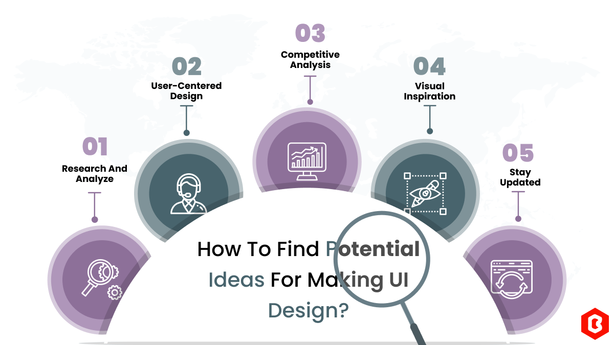
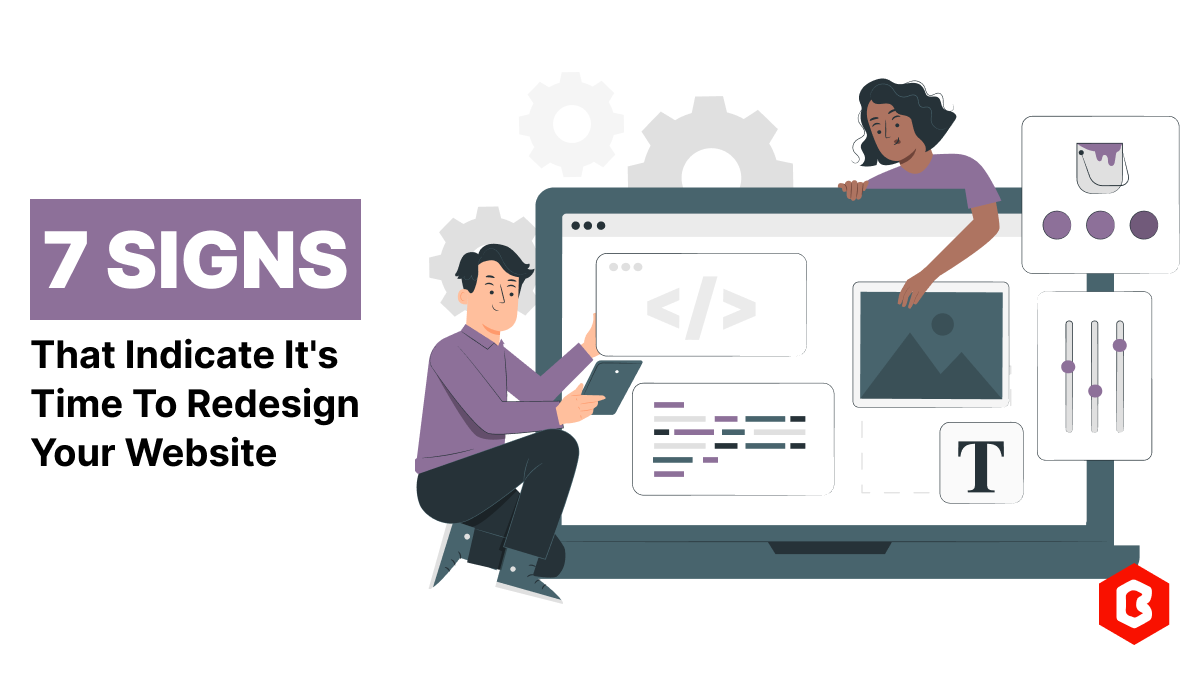
We can discover a lot of alternatives when it comes to UI design or UI thoughts, which we are able t...
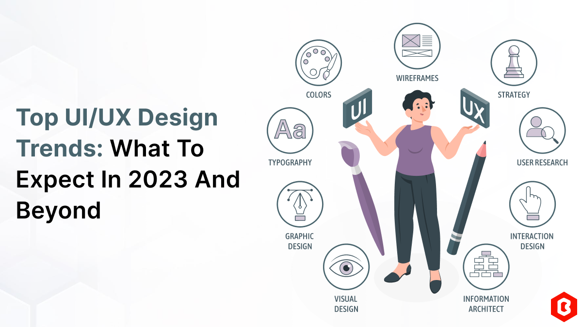
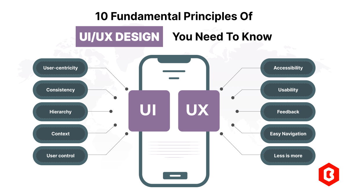
UI/UX. User interface and Use experience are the two important things we can consider in today&rsquo...
Today everything seems to be online whether it's an eCommerce store or a stock broker mobile app...
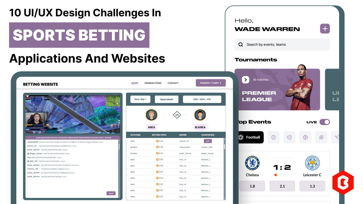
In 2023, the worldwide online betting and lottery market size reached $242.04 Billion. To capture...
Nowadays, every business is operating from an online website which is called a virtual shop. From eC...
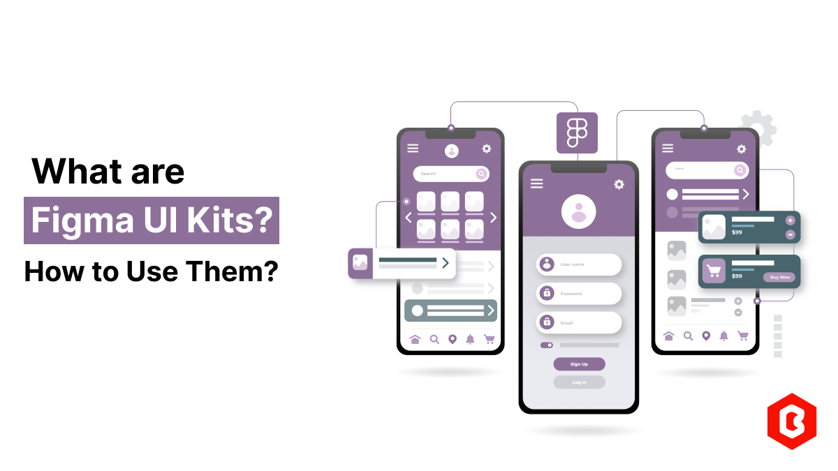
Figma UI Kits are pre-designed sets of UI components, styles, and templates that can be used to spee...

Not sure which template or UI kit fits your project? Reach out for expert advice.

