Buy any 1 product and get 1 absolutely free — this offer applies to all Website Templates, UI Kits, and Complete Scripts.
Buy Now! Article Information Table Of Contents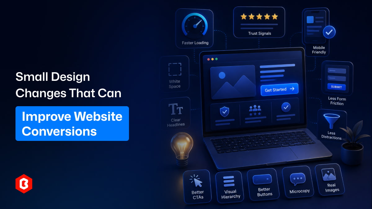
When people talk about improving website conversions, they usually think about big changes. A full website redesign. A new branding strategy. Maybe even rebuilding the entire site.
But honestly, that’s not always necessary.
In many cases, a small design change. The kind you might overlook can quietly make a big difference. These tweaks don’t take months. Sometimes, they don’t even take a full day. Yet they can help visitors stay longer, trust more, and actually take action.
Let’s go through some of those small but powerful changes.
Your CTA is where the decision happens. It’s the moment a visitor either clicks or leaves.
Sometimes the problem isn’t the offer, it’s just how the button looks or feels.
A few simple adjustments can help:
Make the button stand out clearly from the rest of the page
Use simple, direct text like “Get Started” or “Try It Now”
Avoid too many CTAs on the same screen
Add a little spacing around the button so it doesn’t feel crowded
You might notice that when a CTA is easy to spot and understand, people don’t hesitate as much. They just click.
Website speed optimization sounds technical, but the impact is very human.
People don’t like waiting. Even a small delay like 2 or 3 seconds, can push someone away.
Some small improvements you can try:
Compress images so they load faster
Remove unnecessary scripts or plugins
Use simple animations instead of heavy ones
Optimize mobile performance (this matters a lot now)
In a way, speed builds trust. A fast site feels more reliable, even if users don’t consciously think about it.
A crowded page can feel overwhelming. Too much text, too many elements, it creates friction. White space (or empty space) helps users breathe a little.
It doesn’t mean your page looks empty. It just means things are easier to scan.
Here’s what helps:
Add spacing between sections
Keep enough space around headings and buttons
Avoid squeezing too many elements into one area
When everything has room, users don’t feel lost. They move more naturally through the page.
Sometimes websites try too hard to sound smart. Fancy words, long sentences, but the message gets lost.
Your headline should be clear. Almost obvious.
Ask yourself:
Can someone understand this in 2 seconds?
If not, simplify it.
Instead of:
“Revolutionizing Digital Experiences Through Innovative Solutions”
Try:
“Build Better Websites Faster”
Short. Clear. No confusion. And honestly, clarity converts better than creativity in most cases.
A lot of users are on mobile now. Maybe more than desktop, depending on your audience.
But many websites still feel slightly off on mobile. The buttons are too small. Text feels cramped. Sections don’t align well.
Small fixes can help a lot:
Make buttons large enough to tap easily
Keep text readable without zooming
Stack content cleanly instead of squeezing it
Avoid pop-ups that block the whole screen
You might not notice these issues on a desktop, but mobile users definitely do.
People don’t convert if they don’t trust you. It’s that simple.
You don’t need anything complicated here. Just a few small elements can help:
Customer reviews or testimonials
Ratings or user feedback
Logos of clients or partners
Security badges or payment icons
Even something small, like a short testimonial near a CTA, can make a difference.
It gives users that little push, like, “Okay, this seems legit.”
Forms are often where conversions drop.
Too many fields. Too much effort. People just leave.
Try simplifying things:
Ask only for essential information
Use clear labels and placeholders
Break long forms into steps
Show progress (like “Step 1 of 3”)
Honestly, the shorter and simpler the form, the better the chances someone will complete it.
Not everything on your page should have equal importance. Some things should stand out more, like your headline, your CTA, or key benefits.
You can guide attention using:
Font size differences
Bold text for important points
Color contrast
Spacing and alignment
When hierarchy is clear, users don’t have to think too much. They just follow the flow.
Buttons are small, but they carry a lot of weight. A slight design tweak can change how clickable they feel.
Consider this:
Rounded corners often feel more friendly
Subtle shadows can make buttons look clickable
Hover effects give feedback (especially on desktop)
Consistent button styles across the site build familiarity
Sometimes, just changing a button color can improve conversions. It sounds small, but it works.
Microcopy is the small text that guides users, like under a form field or near a button. It’s easy to ignore, but it really helps.
For example:
“No credit card required” under a signup button
“Takes less than 2 minutes” near a form
“We respect your privacy” under the email input
These little lines remove doubt. And removing doubt increases action.
Too many options can actually hurt conversions. If users don’t know where to focus, they do nothing.
Try this:
Remove unnecessary links from key pages
Limit navigation options on landing pages
Avoid too many pop-ups or banners
Keep the page focused on one main goal
In a way, less really is more here.
Stock photos can feel a bit fake sometimes. People can tell. If possible, use real images:
Your team
Your product in use
Real customers (with permission)
It adds authenticity. And authenticity builds connection. Even a slightly imperfect real photo often works better than a perfect stock image.
A bit of movement can make your site feel alive. But too much animation can be distracting.
Keep it simple:
Smooth hover effects
Gentle transitions between sections
Small loading animations
You want the site to feel responsive, not overwhelming.
Improving conversions doesn’t always mean doing something big or complicated. Sometimes, it’s just about noticing the small things. A clearer button. A faster page. A simpler form. These changes don’t seem dramatic at first, but they add up.
And over time, they can make a real difference. So if your website isn’t converting the way you expect, don’t rush into a full redesign. Start small. Test a few changes. See what works. You might be surprised how far small improvements can take you.
 Similar Blogs
In web development, choosing the right CSS framework can make a significant difference in the succes...
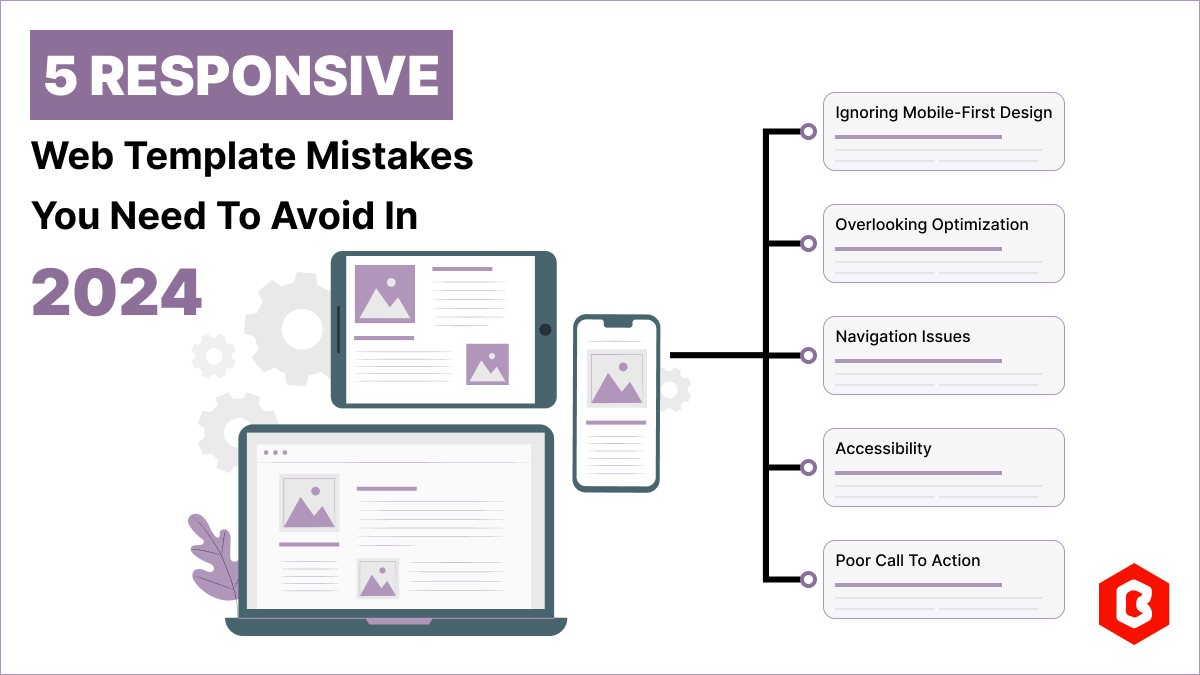
Having a responsive web template can help you succeed and keep your business ahead of the competitio...
Nowadays, every business is operating from an online website which is called a virtual shop. From eC...

In today's digital age, having a strong online presence is no longer a luxury for local businesses -...

Only on Google, every second approximately 99K searches are conducted. Daily this number reaches 8.5...
Figma is an excellent tool for designing user interfaces, but to bring your designs to life from a r...

Not sure which template or UI kit fits your project? Reach out for expert advice.
 100% Satisfaction Guaranteed
  Shop with Confidence!
 Tags
Tags