Buy any 1 product and get 1 absolutely free — this offer applies to all Website Templates, UI Kits, and Complete Scripts.
Buy Now! Article Information
Using a Multipurpose HTML website template in development is not just a shortcut but a smart way to manage the dev cycle. It is a front-end optimized solution that most of the development teams use. But its true worth is in the customization.
You can’t get the generic template and live it on the web by adding plugins, widgets, and tools. To add branding elements and ensure a personalized experience, a website template has to be customized.
This guide focuses on every important aspect when customizing the HTML template. We will discuss what to change, how to do it safely, and which best practices help keep your web development cycle optimized, fast, and professionally managed.
Before editing, you must understand the template’s layout and tech stack. Being directly into changes without a planning model causes regressions and harder debugging.

index.html / page templates: These are entry points and page composition of the template. They usually include header, main, and footer blocks and link to shared partials.
partials / includes: They are recognized as reusable bits (nav, footer, modals). Web templates with modular partials are easier to customize with less coding effort.
assets/: These components have different types of files like CSS, JS, images, and fonts, useful for development. You have to know which files are source (SASS/TS) vs. compiled/minified.
vendor/: They contain third-party libs (Bootstrap, jQuery, Slick). Note that versions, because older libraries can create conflicts or security concerns.
docs/ or demo content: Example content and README text are valuable for learning intended usage.
Expert tip: First, sketch a simple file (a quick bulleted list) showing which files affect the header, hero, components, scripts, and where images live. This approach saves time later.
Templates usually implement responsive behavior via a combination of the following practices:
CSS grid/flexbox + media queries: These systems allow layouts to reflow intelligently at defined breakpoints of the screen. So, components can be scaled, realigned, or stacked without breaking the visual hierarchy.
fluid images and container widths: By using percentage-based widths, max-width, and flexible units, it’s easy to prevent overflow issues and maintain proportional scaling.
mobile-first CSS: Most modern templates adopt a mobile-first approach. It defines base styles for smaller screens and progressively layers enhancements with @media (min-width: ...) rules for every device.
Why it matters: Whether the template is mobile-first or desktop-prioritized determines how you add overrides with customization safely. In fact, a mobile-friendly template is easier to scale and offers better performance on smartphones.
In website templates, the following coding languages are usually available:
HTML: HTML is used for semantic markup and easy accessibility by using a proper heading order and landmark elements.
CSS: A plain CSS or preprocessor (SASS/LESS) coding environment in the template includes .scss. Then, modify the source, not the compiled CSS.
JavaScript: Vanilla JS or frameworks in the template can add functionality and logic. You can check for bundlers (Webpack, Gulp) or simple code concatenation.
Build tools: Some premium templates include NPM scripts for build, watch, and dev tools. Decide whether to use them or work with the prebuilt files.
Expert tip: If the template comes with a build pipeline, use the source pipeline (SASS, ES modules). IT can help with cleaner, maintainable customizations.
Some of the concerns may arise while customizing the HTML template for the website:
Maintainability: By tweaking the small element in CSS can maintain the functionality without requiring to edit the entire JS.
Reusability: The index.html, partials, assets, and docs components in the web template can be reused across web pages for brand consistency.
Testability: Isolating functionality has already been tested, and it makes debugging easier across devices.
Do: Place styles that only affect one component in a component-specific CSS/SASS file. Use data attributes or BEM-style class names to target JS behavior instead of coupling to HTML structure.
Proper preparation prevents accidental breakage, reduces rework, and establishes a stable foundation for the entire web development lifecycle.
When selecting a website template, whether it’s HTML or advanced front-end React templates, check the following aspects:
Documentation quality: Clear, updated documentation accelerates customization and helps you understand the template’s structure, naming conventions, and architectural decisions.
Code quality: Look for semantic HTML, logical CSS architecture (BEM, utility-first, or well-structured components), and clean JavaScript. Good code foundations significantly reduce debugging time.
Dependency freshness: Outdated libraries introduce security vulnerabilities and compatibility problems. Always check the template’s last update date, version history, and supported browsers or frameworks.
Design fit: Pick one with layout patterns close to your target UI. A good fit minimizes structural rewrites and allows your customization efforts to focus on branding rather than rebuilding layouts.
Checklist: Make sure it supports commercial licensing, has responsive optimizations, includes basic accessibility considerations (ARIA roles, contrast-ready components), and uses SEO-friendly markup such as semantic headings and clean meta structure.
A minimal but well-configured environment speeds up customization:
Code editor: Choose an IDE that supports fast front-end workflows. VS Code with Emmet, Prettier, and linting tools offers real-time formatting and clean code consistency.
Local server: Tools like Live Server or npm run dev enable instant reloads. You can verify each customization step without manual refresh.
Version control: Use Git from day one. Create a repo even for solo projects. A repository provides a record of changes, enabling safe experimentation and easy rollbacks.
Browser devtools: Chrome, Firefox, and Edge DevTools help you inspect layouts, test responsive breakpoints, monitor performance, and validate accessibility.
Pro workflow: Use a branch-based Git flow like customization branch, with feature branches for major changes (e.g., brand-colors, hero-redesign).
Working without backups is a common mistake that leads to irreversible loss, especially when templates include minified assets that can’t be regenerated.
Create a pristine copy: Save an untouched version of the template (e.g., template-original/). This acts as a reference point for structural integrity and asset comparison.
Versioned backups: Tag releases in Git or create ZIP snapshots before major modifications. When something breaks, you can instantly refer back to a known-good state and identify what change introduced the issue.
Why it matters: Many templates ship with compressed CSS, JS, or images. Without backups, reverting or reproducing the original structure becomes nearly impossible.
This phase is where your brand, content, and design vision are translated into actual UI structure and visual expression. Thoughtful customization improves consistency, accessibility, and long-term maintainability.
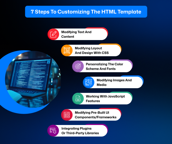
Replace placeholder text with clear, structured content that reflects your messaging hierarchy. Use short paragraphs, descriptive headings, and list formats to improve readability.
Use semantic HTML tags such as main, article, section, and nav to define the content structure. Semantic markup improves accessibility, SEO, and maintainability.
Add meaningful alt text for images and avoid generic link labels like “click here.” Both assist screen readers and improve contextual clarity.
Maintain a logical heading structure (H1 → H2 → H3). Assistive technologies rely on a predictable hierarchy for navigation.
Choosing the right CSS strategy helps you scale and maintain the template cleanly with CSS architecture options:
Utility-first (Tailwind-style): It allows fast prototyping with small utility classes and is efficient to opt in. But it can clutter HTML if unmanaged.
Component-based (BEM): block__element--modifier naming creates clarity and reduces specificity battles. That keeps styles modular.
Atomic / CSS-in-JS: This is suitable when migrating an HTML template into a JS framework environment for state-driven styling.
Here are the practical customization steps:
Identify global design tokens such as colors, spacing, typographic scales, and breakpoints. These are defined in SCSS variables or CSS custom properties (: root). Modifying them cascades changes across the entire template.
Avoid editing vendor CSS directly. Instead, layer your custom stylesheet after vendor files to override safely.
Maintain consistency by using variables for typography, spacing, container widths, and grid systems.
Here’s an example of changing brand color via CSS variables.
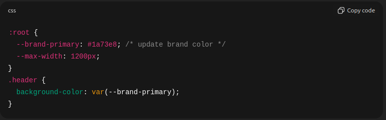
Create a balanced palette including primary, secondary, accent, background, and text colors. Always verify contrast ratios to meet WCAG 2.1 requirements.
Choose performance-friendly fonts. Web-safe or Google Fonts are common options, but hosting fonts locally improves privacy and reduces latency.
Use font-display: swap to avoid invisible text during loading.
Design tip: Limit yourself to two or three font families (e.g., heading, body, UI). This reduces layout shifts, avoids visual noise, and speeds up rendering.
Modern templates rely heavily on images and icons for optimization. It is essential to do:
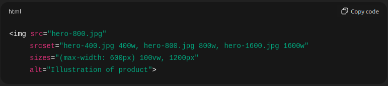
Use modern formats like WebP or AVIF for efficiency. For fallback to compatibility, JPG/PNG is required.
Serve responsive image sizes using srcset and sizes to reduce bandwidth on mobile.
Prefer SVGs for icons, logos, and illustrations for crisp scaling.
Compress images. Use lossless compression for graphics and controlled lossy compression for photographs. This can be considered a website speed optimization strategy.
Here is an example of responsive image markup.
To improve interactivity in a website template, it requires balancing performance, compatibility, and scalability. Always ensure the core experience remains functional even if scripts fail.
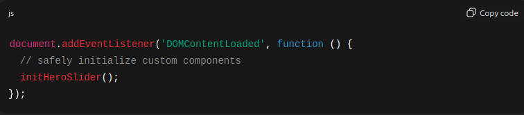
Avoid modifying minified vendor scripts. Instead, extend or override behavior with your own scripts executed after vendor initialization.
Use event delegation for dynamically generated elements. Attach events to higher-level parents to improve performance and reduce memory overhead.
Follow progressive enhancement: Check forms, navigation, and core content remain usable when JavaScript is disabled.
Here is an example for DOM Ready Initialization.
When templates depend on frameworks like Bootstrap or Tailwind CSS for web design, follow the tips:
Bootstrap: Avoid editing its core files. Override using custom classes, or modify Bootstrap variables if recompiling.
Tailwind: Make changes in tailwind.config.js and recompile, ensuring consistency across utility classes.
Versioning Tip: Framework upgrades often break overrides. Maintain a changelog documenting what you modified.
Prefer lightweight, actively maintained plugins to avoid performance bottlenecks in the website.
Consider CSS-only alternatives (e.g., CSS scroll snap instead of JavaScript sliders) for better performance.
Load third-party scripts asynchronously and handle GDPR/CCPA requirements if using analytics, chat widgets, or tracking tools.
Security best practice: Vet every external script. Third-party code, especially from CDNs and resources, may introduce security or privacy risks.
QA & Testing in web development checks that customizations do not introduce regressions, layout issues, accessibility barriers, or broken interactions. A structured testing workflow helps you catch issues before they reach end users and reduces long-term maintenance effort.

Different browsers interpret CSS and JavaScript slightly differently, so verifying compatibility is essential.
Test in all major browsers: From Chrome to Firefox and Safari to Edge, check that the changes you made work properly in every web browser.
Check important features:
CSS Grid and gap support are not affecting the user experience.
position: sticky behavior remains aligned or floats differently in Chrome or Edge.
Newer JavaScript APIs and ES features impact the functionality as it not optimized.
Recommended tools for testing:
BrowserStack, LambdaTest, or local virtual machines good choice for a real environment experience.
DevTools emulation for quick checks on layout, screen size, and throttling can be helpful.
Cross-browser testing is recommended to make a website workable for every user’s preference.
Real device testing remains the gold standard. Emulators cannot fully simulate device-specific behavior, such as font rendering or touch latency.
Watch for the following aspects:
Tap target sizes: Minimum 44px recommended for accessible touch interactions in small-sized devices.
Viewport configuration: A proper [meta name="viewport"] tag ensures correct scaling when the site is loaded on desktop and mobile.
Layout stability: The entire website layout has to be optimized correctly. Avoid cumulative layout shift (CLS) caused by late-loading fonts, images without dimensions, or dynamic ads.
Ultimately, testing on different screen sizes uncovers issues that desktop resizing alone may miss.
Validation in your markup and styles follows standards and remains maintainable.
Run HTML validation using W3C Validator to catch structural errors.
Use CSS linters to detect unused rules, accidental high specificity, or invalid properties.
Accessibility testing tools: axe, Lighthouse, WAVE, or DevTools Audits to identify ARIA misuse, missing labels, contrast failures, and keyboard navigation issues.
These checks strengthen code quality and reduce future debugging time
Some types of issues appear frequently during template customization:
Overlapping elements: It is caused by absolute positioning, incorrect flex/grid settings, or missing height constraints. Inspect computed styles and verify the stacking context (z-index, position hierarchy).
Broken images or file paths: Ensure paths are correct relative to the deployment environment. Update the base URL if hosting in subdirectories.
Conflicts with third-party code: Temporarily disable external scripts or stylesheets to pinpoint clashes. Reintroduce them one at a time to confirm the source.
Identifying patterns behind common bugs accelerates troubleshooting.
This final stage transforms your local development work into a polished, performant, and discoverable website ready for public use.

Performance is important both for user experience and SEO. Optimizations should focus on reducing network overhead, improving rendering speed, and delivering only what is necessary.
Minify and combine assets: Compress CSS and JavaScript files, and merge them when logical to reduce HTTP requests. With HTTP/2, you can also rely on multiplexing, where combining files is unnecessary.
Use a CDN: Deliver static assets like images, CSS, JS, and fonts through a CDN. Geo-distributed caching ensures faster load times for global audiences.
Implement caching strategies: Set long-lived cache headers for static assets. Use filename hashing for cache-busting so users always get the latest version after an update.
Lazy-load non-critical resources: Use loading="lazy" for images, lazy-load iframes, and apply dynamic imports for non-essential JavaScript widgets.
Run performance audits: Use Lighthouse or WebPageTest to evaluate performance, accessibility, SEO, and best practices.
Search visibility depends heavily on your template’s semantic structure, metadata, and crawlability.
and that summarizes its content accurately.
Use descriptive metadata: Every page should have a unique title and meta name="description" that summarizes its content accurately.
Maintain a strong semantic hierarchy: Use one H1 per page and descriptive H2/H3 headings to structure topics clearly.
Add canonical URLs: A rel="canonical" tag prevents duplicate content issues, especially when pages have similar content or tracking parameters.
Structured data: Add JSON-LD schemas (Organization, Article, FAQ, Product) to improve eligibility for rich results in search engines.
Crawl optimization: Include a sitemap and a well-configured robots.txt file. From it, the crawling of the web pages can be optimized.
Accessibility and SEO Overlap:
Accessible markup includes meaningful alt text, logical headings, and readable link text. It supports both screen readers and search engine crawlers.
Deploying your customized template can be straightforward, but it requires the right hosting choice and a reliable deployment pipeline.
Choose a hosting platform:
Static sites: Pick the platforms from Netlify, Vercel, GitHub Pages, and Cloudflare Pages. It is useful for a portfolio showcase.
Traditional hosting: Here, shared hosting, VPS, or dedicated servers are available to make the website available to users.
Choose anyone based on expected traffic, performance needs, and backend requirements.
Use automated deployments: A CI/CD pipeline triggered from Git commits ensures consistent builds and reduces manual errors.
Final launch checks:
DNS is configured correctly or not.
SSL certificate installed (e.g., Let’s Encrypt) on the website.
Sitemap.xml and robots.txt are accessible. (Ensure through manual check)
Analytics (GA4 / Plausible) is working along with Google Tag for tracking.
Error monitoring is enabled to find issues in real-time and take steps to solve them.
Performance was checked post-deployment with analytics measurement.
The work doesn’t end at deployment. Real user interactions reveal issues that don’t appear in local testing.
Monitor error logs (server and browser console). Identify the most common one and try to solve those errors.
Track analytics for bounce rate, page load, and user behavior. Check if it’s from the UI design issues, plugin misconfiguration, or the content is not optimized well for users.
Check for accessibility regressions after content updates, including meta tags, layout shifts, and visuals.
Be ready with rollback workflows in Git or the platform deploy history. It is important to keep a check on everything that is working efficiently through tracking in Git.
One thing to note is that continuous monitoring helps maintain performance, security, and UX over time.
Customizing a multipurpose HTML template is a combination of a technical task and a way to match your brand’s personality and goals. By understanding the template’s structure, refining its design, and optimizing its performance, you turn a generic layout into something uniquely yours. The process gives you both creative freedom and practical efficiency to build a website faster without sacrificing quality.
As you move forward, don’t forget to continue monitoring, testing, refining, and improving your pages based on real user behavior. This ongoing approach makes your website stay relevant, useful, engaging, secure, and ready to grow with your business.
 Similar Blogs
Picking the perfect style for your website is a major decision, especially in the vast scope of web...

Designing and developing a website may look tough and time-consuming. It is actually tough when it c...
Developing a website has now been important to reach a wider audience. Performing web development fr...

Having an interactive and functional website is a core aspect of making a successful online business...

In today's digital age, having a strong online presence is no longer a luxury for local business...

Every business needs better marketing to promote their products and services. Nowadays, they prefer...
Related Products 
Not sure which template or UI kit fits your project? Reach out for expert advice.
 100% Satisfaction Guaranteed
  Shop with Confidence!
 Tags
Tags