Buy any 1 product and get 1 absolutely free — this offer applies to all Website Templates, UI Kits, and Complete Scripts.
Buy Now! Article Information
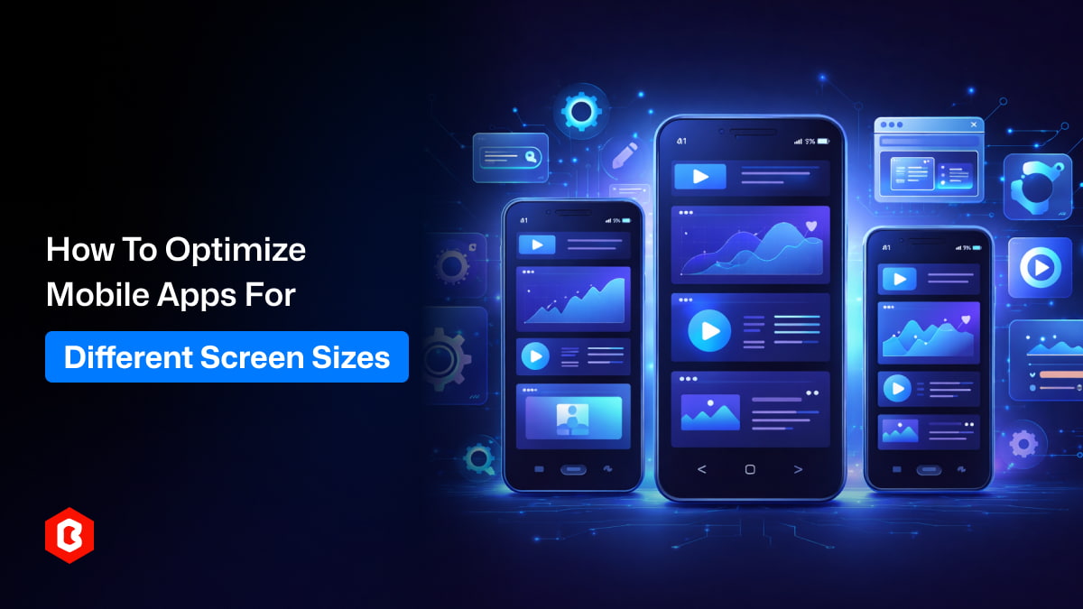
Mobile apps run on many devices with different screen sizes, resolutions, and formats, including smartphones, tablets, and foldable phones. If apps are not optimized properly, users may experience layout issues, unreadable text, or difficult navigation. To avoid these problems, developers should use responsive layouts, flexible UI components, and scalable design systems. Tools like UI kits and Flutter templates also help create consistent and adaptable mobile app interfaces.
Different mobile devices have different screen sizes. Some phones have small, compact displays, while others offer larger screens that are better for multimedia and productivity. Tablets and foldable devices add even more complexity, as their unique screen formats require layouts that can adapt smoothly.
Developers must consider several screen-related factors when designing an app.
Screen resolution: Determines how sharp the interface appears.
Aspect ratio: Affects how content is arranged vertically and horizontally.
Pixel density: Influences how UI elements scale across devices.
Orientation: Portrait and landscape layouts may require different designs.
Ignoring these factors can lead to interfaces that look good on one device but fail or appear broken on another. Understanding the wide range of screen sizes and formats is the first step toward building mobile interfaces that adapt smoothly across different devices.
Responsive layout design allows an app interface to adjust automatically based on the screen size. Instead of relying on fixed dimensions, developers use flexible layouts that adapt to the available space.
In responsive design, UI elements can expand, shrink, or reposition depending on the device being used. This helps maintain both visual balance and usability across different screen sizes.
For example, a mobile app might display content in a single column on smaller screens, but switch to multiple columns on larger devices. Navigation menus can also change their layout depending on screen width.
Responsive design helps ensure that users enjoy a consistent and smooth experience, no matter which device they use.
Another important strategy is to use flexible UI components. Instead of designing elements with fixed sizes, developers should build components that can adjust and adapt dynamically based on the available screen space.
Below are some important examples:
Flexible containers that resize based on screen width.
Adaptive images that scale without losing quality.
Resizable buttons that maintain proper tap areas.
Dynamic text blocks that wrap content correctly.
These components help keep the interface readable and functional across different screen sizes.
Using reusable design systems, such as a mobile app UI kit, can make this process much easier. UI kits offer ready-made components that are already built to be flexible and responsive, helping developers create consistent interfaces more quickly.
Text readability is a key part of mobile usability. Since mobile screens are smaller, typography must be planned carefully so that content stays clear and easy to read without making the interface feel crowded.
Instead of using fixed font sizes, developers should rely on scalable typography systems that adjust smoothly across different screen sizes and devices.
Key typography practices:
Use relative units instead of fixed pixel sizes.
Maintain proper line spacing for readability.
Adjust heading sizes for different screen categories.
Test readability across multiple device sizes.
Proper typography scaling ensures that users can read content comfortably on both small phones and large tablets.
Grid systems help designers keep layouts structured and consistent across different screen sizes. By dividing the screen into organized sections, grids make it easier to place content in a clear and balanced way.
When the screen size changes, grid-based layouts can adjust automatically, rearranging components while still maintaining a clean and visually balanced interface.
Screen Type | Layout Example |
Small phones | Single-column layout |
Medium devices | Two-column layout |
Large screens | Multi-column layout |
Tablets | Expanded layout with additional spacing |
Using grid systems also helps keep elements properly aligned and improves visual consistency across different devices and screen sizes.
Navigation is one of the most important parts of a mobile app interface. When screens are smaller, poor navigation can quickly make the app difficult to use because space is limited.
Adaptive navigation design helps make sure users can still reach important features easily, no matter what device they are using.
For smaller devices, simple options like bottom navigation bars or hamburger menus usually work best. On larger screens, designers can display additional navigation elements without making the interface feel crowded.
Many design systems, including those found in a mobile app UI kit, provide multiple navigation styles that can be used across different device sizes.
Testing is an essential step when optimizing apps for different screen sizes. Developers should check their interfaces on multiple devices and simulators to make sure layouts adjust properly and work as expected.
Important testing steps:
Checking layout alignment on small and large screens.
Testing both portrait and landscape orientations.
Ensuring buttons remain easy to tap.
Verifying that text remains readable.
Many development tools offer device emulators that help simulate different screen sizes. However, testing on real devices is still highly recommended because it shows how the app truly behaves in real-world conditions.
Proper testing helps developers spot layout problems early and fix them before the app is released to users.
Modern frameworks provide built-in tools to support responsive layouts. Flutter is one of the most popular frameworks for cross-platform mobile development.
Flutter allows developers to build flexible layouts that automatically adapt to screen sizes. Widgets such as Expanded, Flexible, and MediaQuery help control layout behavior.
Many developers speed up the design process by starting with a mobile app Flutter template. These templates include pre-designed UI structures that are already optimized for multiple screen sizes.
Using a mobile app Flutter template allows teams to focus more on features and functionality rather than building layouts from scratch.
Media content, such as images and videos, also needs to adapt to different screen sizes. If not optimized properly, images may appear stretched, cropped incorrectly, or simply too large for smaller devices.
To avoid these issues, developers should use responsive media handling techniques.
Images should scale properly while maintaining their original aspect ratios. Vector graphics are often a good option because they stay sharp across different screen resolutions.
Developers should also optimize image file sizes to improve loading speed and overall performance.
When media is properly optimized, the app interface stays visually appealing and consistent across all devices.
Spacing between UI elements plays an important role in readability and overall usability. On smaller screens, crowded interfaces can make it hard for users to read content or tap the right elements.
To avoid this, designers should follow proper spacing guidelines so the interface stays clear, balanced, and easy to interact with.
Below are the key considerations for spacing:
Adequate padding around buttons and interactive elements.
Proper margins between sections of content.
Consistent spacing between icons, text, and images.
Touch-friendly button sizes for easier interaction.
Design systems and UI frameworks often include predefined spacing rules that help maintain consistent layouts across different screen sizes. These guidelines make it easier for designers and developers to keep interfaces balanced and visually organized on every device.
Different mobile devices come with different screen sizes, so responsive design is very important for mobile apps. Without proper optimization, apps may look broken or difficult to use on some devices. Developers can improve this by using flexible layouts, scalable text, and structured grid systems. Testing apps on multiple devices also helps find issues early. Tools like mobile app UI kits and Flutter templates make it easier to create consistent, responsive interfaces that work smoothly on any screen size.
 Similar Blogs
In today's world, web applications are controlling the business arena. Whether it's an eComm...

Flutter is Google's open-source framework, which has revolutionized mobile app development. Its...

User Interface (UI) design is the backbone of a mobile application. UI design for mobile apps can be...

Mobile apps have become an important part of our lives in this digital world. According to the most...

Creating high-quality mobile apps is a must in today’s digital world. However, frontend develo...

Startups today face huge pressure to launch fast, save money, and reach their customers on mobile pl...

Not sure which template or UI kit fits your project? Reach out for expert advice.
 100% Satisfaction Guaranteed
  Shop with Confidence!
 Tags
Tags