Buy any 1 product and get 1 absolutely free — this offer applies to all Website Templates, UI Kits, and Complete Scripts.
Buy Now! Article Information
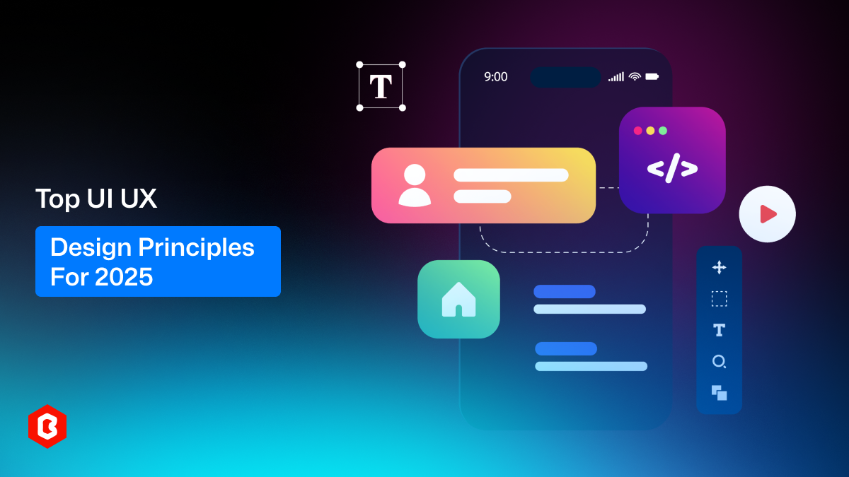
User Interface and User Experience design principles are always changing. As we move into 2025, designers must follow the latest design trends to create more effective apps and websites. A good interface should be easy to use and visually appealing. A strong user journey begins with good UI and UX principles.
Whether you're working on app design, responsive design, or mobile design, using the right UI UX guide will help you create better user experiences. This article covers ten key UI principles and ten key UX principles to follow in 2025. These ideas will help you improve your interface design, build modern designs, and use intuitive design techniques.
Simplicity: A simple design removes all the extra clutter. Only show what really matters for users. This makes the interface easy to understand and use. Simple buttons, clean backgrounds, and fewer pop-ups help users focus. Whether it’s a mobile UI or a website UI, simplicity is always better.
Consistency: Use the same fonts, button styles, and colors everywhere in the UI design. A consistent look helps users feel more comfortable. When screens look alike, users don’t need to relearn how to use each page. This is important in both app design and responsive web design.
Visual Hierarchy: Use size, color, and placement to show what is important. Bigger and bolder items catch attention first, as you can see in the Astro Pepe Coin Web UI Kit. Highlight key actions like “Buy Now” or “Submit.” A strong visual hierarchy improves the user journey and helps users find what they need quickly.
Feedback and Responsiveness: Users want to know whether their actions work or not. Use animations, sound, or messages to give feedback. A loading spinner, a checkmark, or a small vibration can confirm the user’s action. This is a part of responsive design and makes apps or websites feel more modern and alive.
Accessibility: Make sure people with vision, hearing, or movement disabilities can use your platform without any issues. You can use large text, clear buttons, sufficient color contrast, and voice-friendly features. Accessibility is now considered one of the most important UI principles for 2025.
Clarity: Avoid adding confusing icons or hidden buttons to the app or website UI. Use simple shapes and known symbols, or simply purchase a professionally designed Figma UI kit according to your business needs. The layout should be clear and understandable at a glance. Users should not feel lost. In a well-designed interface, every element serves a clear purpose.
User Control: You can offer undo options, clear exits, and easy ways to change settings. Users should not feel stuck or forced when using your platform. Giving users control builds trust and enhances the overall experience. This applies to UI for apps, especially in mobile settings.
Error Prevention and Recovery: Use real-time checks to prevent wrong inputs. For example, alert users to strengthen a weak password. Also, provide easy options such as “Undo” or “Back” to help them correct common mistakes. This makes users feel secure when they need to take essential and confidential actions while browsing your platform.
Aesthetics and Visual Appeal: When designing your app or website’s UI, use matching colors, clean icons, and stylish fonts. A good-looking app makes a strong first impression. Users often judge apps by their appearance. Focus on a modern design that aligns with current UI/UX trends.
Scalability and Adaptability: Your website’s UI should adjust to mobile, tablet, or desktop. Similarly, your app’s UI should work on iOS and Android mobiles. Test the layout on different screens and browsers. This makes the product more flexible and user-friendly. Good responsive design is a must in 2025.
User-Centricity: Understand what users expect from your platform. Design the website or app’s UI to meet users’ expectations. Ask questions like: What is the goal? What issues may they face? A user-centric approach keeps the focus on helping the user succeed.
Context: Think about the environment and device from the user’s perspective. Are they using the app outdoors, on a mobile phone, or while multitasking? The design of your platform must fit real-world situations. Context-based design enhances usability and is now a crucial component of UX principles.
Usability: People should not need a guide or tutorial to use your platform more than once or twice. Keep actions short, clear, and easily accessible. Test with real users to find and fix issues in user-friendliness. A usable app or website keeps users satisfied and increases engagement.
Visual Storytelling: People love visual content when browsing a digital platform. Use interactive graphics, photos, icons, and step-by-step progress bars to explain the journey. A good visual hierarchy and layout can help you tell a story without words. This keeps users more involved.
Clear Information Architecture: Put similar items together in the UI Design. Keep the menu short and to the point. Avoid deep navigation where users must click many times. A well-structured website or app enhances the entire user experience and makes browsing more seamless.
Easy Navigation: You can use sticky menus, back buttons, and search tools to offer simple navigation. Labels must be simple and straightforward throughout the user interface. Easy navigation enhances the UX design of your website or app and keeps users from getting lost or frustrated.
Less Is More: Avoid using too many pop-ups, links, or unnecessary steps on a screen. Clean, uncluttered screens reduce confusion and keep the user focused. Each screen should guide users toward one clear action, so they can easily understand what to do next. This idea works well in intuitive design and mobile UI.
Clear Language: Use simple and friendly language and visuals. Don’t use tech words or long, tricky sentences. Ensure every button clearly indicates its function, such as “Save,” “Upload,” or “Continue.” Clear labels help users know what to do next. This simple rule is key to good UX and helps everyone feel more comfortable using your app or website.
Typography: Use clean, readable fonts throughout the app or web UI, or get a ready-to-use solution like the Artistry Web UI Kit. Make sure text size is large enough, especially on mobile screens. Use good spacing between lines and sections. Typography affects both the appearance of your app and the user experience.
Emergency Exit: Always provide users with an easy way to exit. If someone is filling out a form, they should see a clear “Cancel” button, and it shouldn’t erase everything unless they choose to. Letting people leave or undo something without pressure makes them feel safe. This is especially important in apps that handle personal information or payments, where users need to feel secure.
Great UI UX design combines how your product looks with how it functions. By following these 20 principles, you can make your app or website easier to use, more visually appealing, and more successful.
If you want to design faster, you can use ready-made Figma UI Kits from Theme Bitrix. These ready-to-use items follow many top trends and UI/UX principles, helping you build faster without missing key ideas. They’re perfect for anyone wanting to learn UI UX or make better app and interface design.
Apply these tips today, and make your next app or web design more modern, clear, and user-friendly.
 Similar Blogs
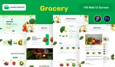
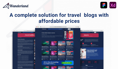
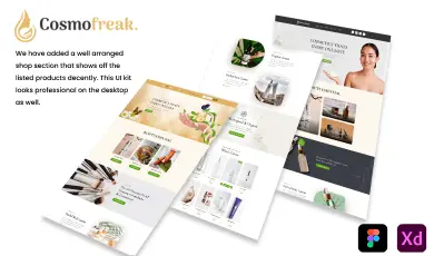
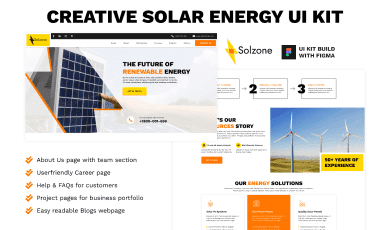
Purchasing UI kits online minimizes a business’s efforts in designing websites or apps. We can...

Today everything seems to be online whether it's an eCommerce store or a stock broker mobile app...

Having an interactive and functional website is a core aspect of making a successful online business...
In 2023, the worldwide online betting and lottery market size reached $242.04 Billion. To capture...
Nowadays, every business is operating from an online website which is called a virtual shop. From eC...

Have you ever played and learned about the best experience for exciting mobile gaming? So, welcome H...
Related Products 
Not sure which template or UI kit fits your project? Reach out for expert advice.
 100% Satisfaction Guaranteed
  Shop with Confidence!
 Tags
Tags