Buy any 1 product and get 1 absolutely free — this offer applies to all Website Templates, UI Kits, and Complete Scripts.
Buy Now! Article Information
User experience is quite important for the success of any mobile app or website. However, the digital world is very quick, and companies do not want to spend months designing and prototyping every small element from scratch. Instead, they prefer purchasing UI kits from online marketplaces like Theme Bitrix. These are collections of design elements, components, and templates that developers and designers use to build user interfaces quickly. With web or mobile app UI kits, you get buttons, navigation bars, forms, complete screen layouts, etc, to create polished, consistent, and user-friendly digital solutions.
However, simply downloading or purchasing a UI kit isn’t enough; you should learn best practices to use them to utilize their full potential. In this article, we have discussed the essentials of UI kits, how to choose the right one, and the best ways to use them effectively in both web and mobile app development.
We can consider a UI kit as a toolbox for designers as well as developers. Usually, it contains pre-designed elements like icons, typography styles, buttons, input fields, menus, etc. On Theme Bitrix, you can find UI kits with entire screen layouts.
In the past, designing every element from scratch resulted in inconsistency and time consumption. Nowadays, UI kits save time by offering ready-made assets, improve collaboration between designers and developers, provide consistency, and help businesses launch websites or apps faster. That’s why they have become standard in design and development.
Modern UI kits are often platform-specific. Some are for websites, which are known as web design UI kits, while others are for Android and iOS apps, which are known as mobile app UI kits. They are designed in Figma to improve collaboration and simplify the development process.
Every project cannot use the same UI kit. Choosing the right Figma UI kit on factors like project goals, platform, and team workflow. Here are some points to consider:
Ensure you purchase a web design UI kit to build a website and a mobile app UI kit to build an application for Android and iOS. Buying the wrong kit can result in an inconsistent design.
UI kits come in different design languages, such as minimal, material design, futuristic, or e-commerce-focused. Therefore, purchase a design template that matches your brand identity.
Consider purchasing a UI kit that allows easy customizations. A less flexible UI kit may limit the modification abilities of the user interface according to your brand.
Figma is the most widely used tool for designing and modifying the interface of any website or app. Make sure that you purchase a Figma UI kit for easy customizations and onboarding.
A well-documented UI kit helps you with click implementation. Always check if the UI kit comes with usage instructions, distortion-free components, and a professional appearance.
Though UI kits speed up the web or app design process, you should use them thoughtfully. Let’s have a look at the UI design best practices for developers.
UI kits should be used to maintain visual and functional consistency across all screens. For example, buttons, typography, and color schemes should remain consistent throughout the website or mobile app. So, users can easily navigate and trust your platform.
Consider purchasing the Figma UI kit that can grow with your project. If you are starting with a small MVP with further expansion plans, the UI kit must be scalable enough to adapt to growth and implement new features without breaking the design flow.
Avoid using UI kits without customizing the design. They just provide the foundation, but your platform must reflect your brand’s identity. Modify colors, typography, and layouts according to your brand guidelines without affecting the overall usability.
UI kits are not just for designers, so developers should also understand and use them. Shared design systems and version-controlled kits in platforms like Figma improve collaboration between teams and reduce miscommunication.
Figma has become the most popular design tool globally, and its UI kits are highly valued because of the following benefits:
Cloud-Based Collaboration: Multiple designers and developers can work on the same UI kit in real time.
Scalable Components: Figma’s component system allows easy scaling of design elements across different screens.
Cross-Platform Access: Since Figma can be used in the browser, anyone can access a UI kit and contribute without software installation.
Faster Prototyping: With ready-to-use UI kits, teams can move quickly from wireframes to high-fidelity prototypes.
Community Resources: Figma has a large community offering free and premium UI kits that suit various industries.
With the help of Figma UI kits, you can speed up your app or web development process and ensure design consistency across teams and projects.
While UI kits are powerful, they can be misused sometimes. Below are some common mistakes to avoid:
Using Kits Without Customization: Products end up looking generic if you don’t adapt the kit to your brand.
Mixing Multiple Kits: Combining too many different kits creates inconsistency in design elements.
Ignoring Responsiveness: Some teams forget to adjust UI kits for different screen sizes, leading to a poor user experience.
Skipping Documentation: Not documenting how a kit is used can cause confusion when scaling projects or onboarding new team members.
Relying Too Heavily: UI kits are a foundation, not a complete product. Over-reliance can limit creativity and originality.
UI kits play a key role in building websites faster. A well-structured web UI kit often includes:
Navigation bars and headers.
Forms, input fields, and buttons.
Typography styles for headings, body text, and footers.
Card layouts for displaying content.
Pre-made templates for landing pages and dashboards.
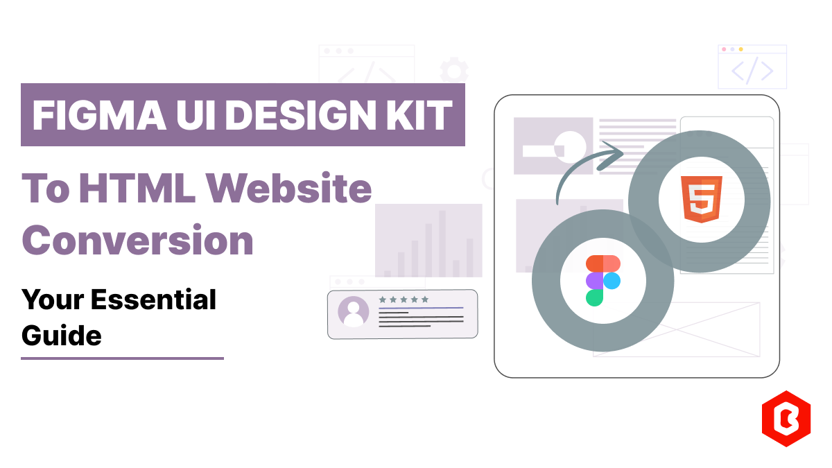
There are some modern ui kits for website design on Theme Bitrix, which can be converted into a complete front-end project using their Figma to HTML service. This reduces the gap between design and coding, so developers can implement designs directly.
Mobile apps have different design requirements compared to web applications. UI kits for mobile usually follow platform-specific guidelines like Apple’s Human Interface Guidelines or Google’s Material Design.
A good mobile app UI kit includes:
Navigation menus (bottom tabs, side drawers).
Pre-styled input fields and forms.
Ready-to-use screens like login, profile, and onboarding.
Icon sets optimized for mobile resolutions.
Color palettes that enhance visibility on smaller screens.
Using Figma ui kits for mobile apps helps developers maintain a native user experience, which improves usability and user satisfaction.
UI kits evolve with technology. Here are some expected trends for the future:
AI-Powered UI Kits: Artificial intelligence will generate adaptive UI kits based on project requirements, reducing manual effort.
Responsive-First Design: Future kits will focus on designing once and adapting seamlessly across all devices.
Cross-Platform Kits: UI kits will blur the lines between web, mobile, and even wearable devices by offering universal design systems.
Integration with Code: UI kits may evolve into code-ready components that developers can directly plug into frameworks like React or Flutter.
Accessibility Focus: More kits will prioritize inclusive design, ensuring products meet accessibility standards from the start.
UI kits are now an important part of web and mobile app development. They make the process faster, help maintain design consistency, and reduce extra effort for both designers and developers. Instead of spending weeks building every single element, you can start with ready-made kits and then adjust them to fit your brand style.
For anyone working in web or mobile app development, learning how to use UI kits effectively is a must for building modern and user-friendly platforms.
 Similar Blogs
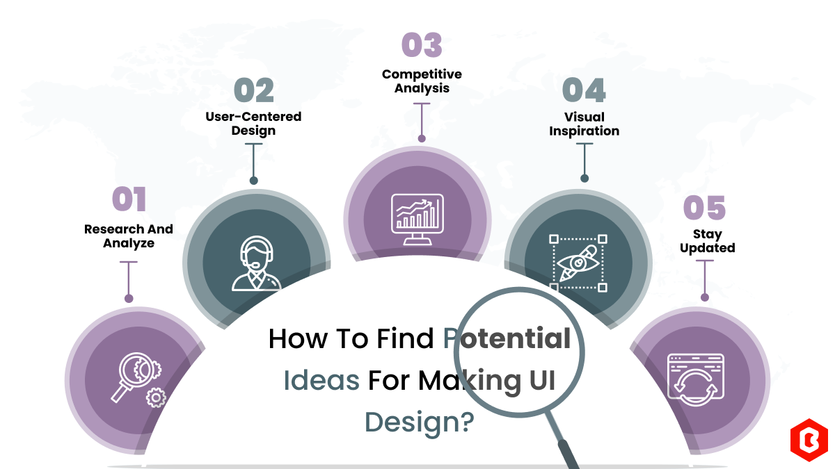
We can discover a lot of alternatives when it comes to UI design or UI thoughts, which we are able t...
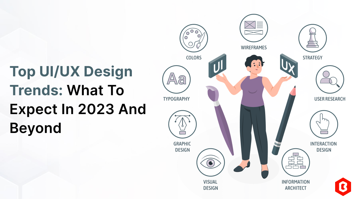
UI/UX. User interface and Use experience are the two important things we can consider in today&rsquo...
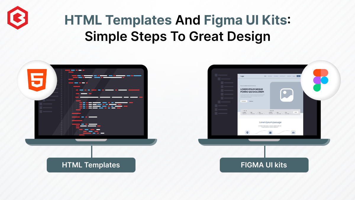
Designing and developing a website may look tough and time-consuming. It is actually tough when it c...
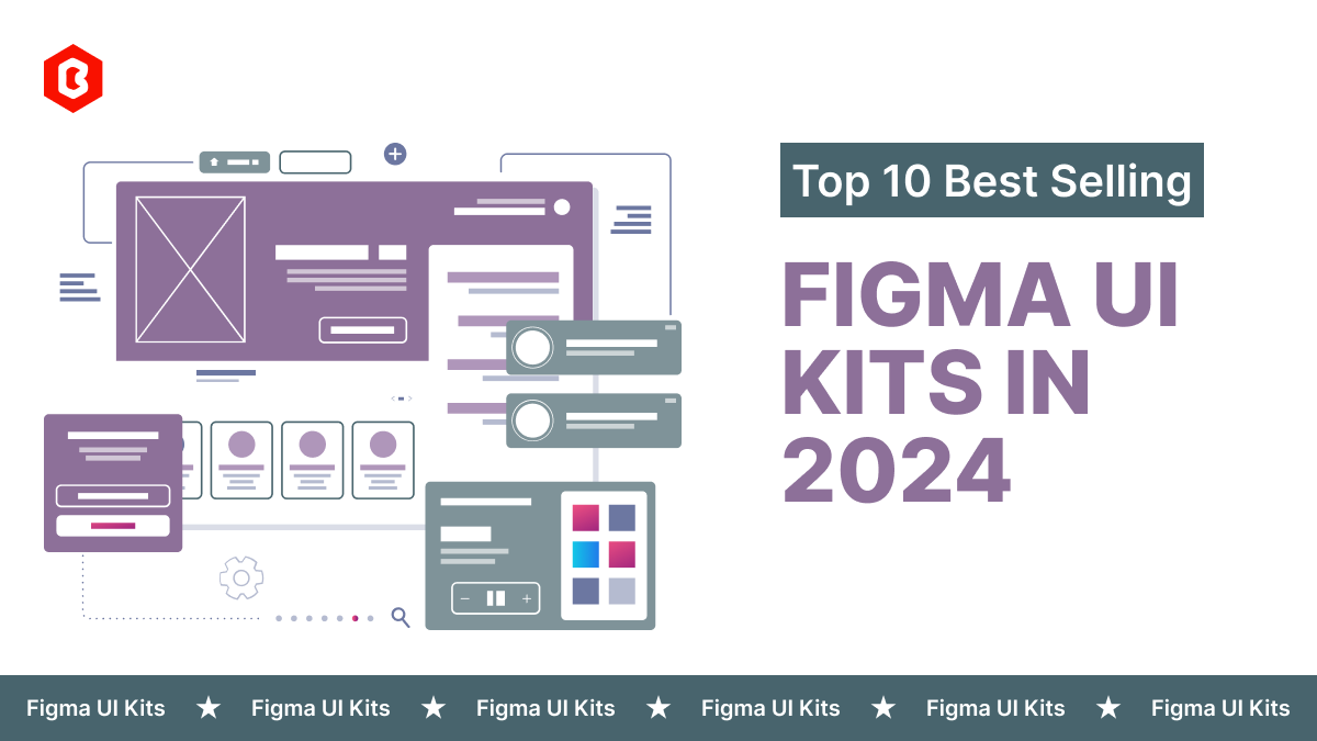
Purchasing UI kits online minimizes a business’s efforts in designing websites or apps. We can...
Having an interactive and functional website is a core aspect of making a successful online business...

Have you ever played and learned about the best experience for exciting mobile gaming? So, welcome H...

Not sure which template or UI kit fits your project? Reach out for expert advice.
 100% Satisfaction Guaranteed
  Shop with Confidence!
 Tags
Tags